Content Table:
Introduction
Basic Syntax Overview
Key Features
Introduction
Welcome to the tutorial for ArkTS, a TypeScript-based programming language designed specifically for building high-performance mobile applications.
ArkTS is optimized to provide better performance and efficiency while maintaining the familiar syntax of TypeScript.
Basic Syntax Overview
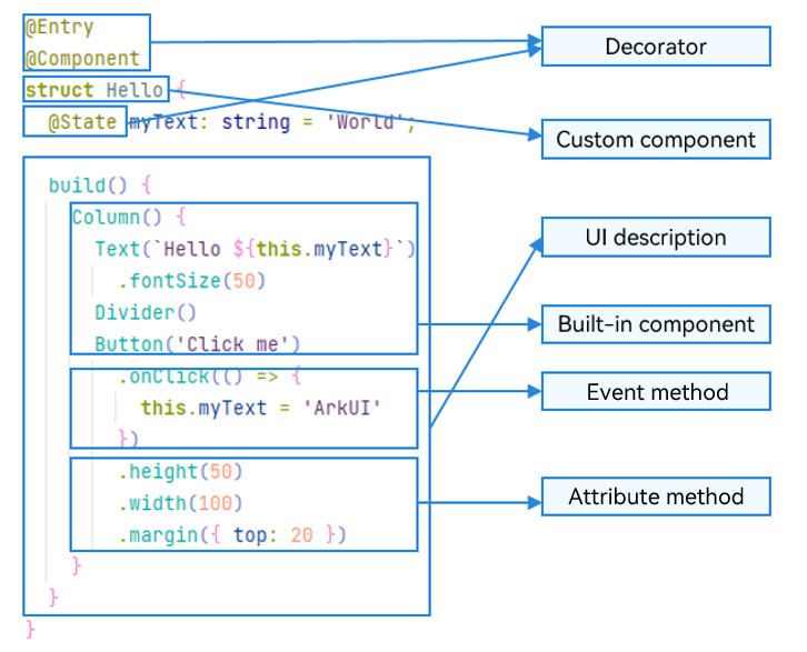
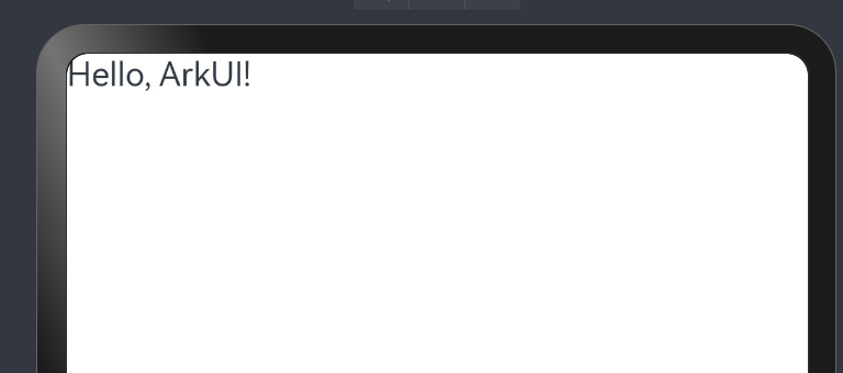
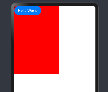
With a basic understanding of the ArkTS language, let’s explore its composition through an example. As shown below, when the user clicks the button, the text content changes from “Hello World” to “Hello ArkUI.”
Portions of this documentation are adapted from OpenHarmony Documentation by OpenHarmony community, licensed under CC BY 4.0.
Figure 1 Example effect drawing

In this example, the basic composition of ArkTS is as follows:
Figure 2 Basic composition of ArkTS
NOTE
The name of a custom variable cannot be the same as that of any universal attribute or event.
- Decorator: A design pattern used to decorate classes, structs, methods, and variables to assign special meanings to them. In the preceding sample code,
@Entry,@Component, and@Stateare decorators.@Componentindicates a custom component.@Entryindicates that the custom component is an entry component.@Stateindicates a state variable in the component, whose change will trigger the UI to re-render.
-
UI description: A declarative description of the UI structure, such as the code block of the build() method.
-
Custom component: A reusable UI unit that can be used with other components, such as the struct Hello decorated by
@Component. -
Built-in component: A default basic or container component preset in ArkTS, which can be directly invoked, such as Column, Text, Divider, and Button components in the sample code.
-
Attribute method: A method used to configure component attributes, such as fontSize(), width(), height(), and backgroundColor(). You can configure multiple attributes of a component in method chaining mode.
- Event method: A method used to add the logic for a component to respond to an event. In the sample code, onClick() following Button is an event method. You can configure response logic for multiple events in method chaining mode.
Key Features
Declarative UI
ArkTS declaratively combines and extends components to describe the UI of an application. It also provides basic methods for configuring attributes, events, and child components to help you implement application interaction logic.
Portions of this documentation are adapted from OpenHarmony Documentation by OpenHarmony community, licensed under CC BY 4.0.
Creating a Component
Depending on the builder, you can create components with or without mandatory parameters.
NOTE The new operator is not required when you create a component.
Without Mandatory Parameters
A struct without mandatory parameters is a component defined with empty parentheses. For example, the Divider component:
Column() {
  Text('item 1')
  Divider()
  Text('item 2')
}
With Mandatory Parameters
A struct with mandatory parameters is a component whose API definition expects parameters enclosed in parentheses.
-
Set the mandatory parameter src of the Image component as follows:
Image('https://xyz/test.jpg') -
Set the optional parameter content of the Text component.
// Parameter of the string type Text('test') // Add application resources in $r format, which can be used in multi-language scenarios. Text($r('app.string.title_value')) // No mandatory parameters Text() -
You can also use variables or expressions to assign values to parameters. The result type returned by an expression must meet the parameter type requirements. For example, to set a variable or expression to construct the Image and Text components:
  Image(this.imagePath)
  Image('https://' + this.imageUrl)
  Text(`count: ${this.count}`)
Configuring Attributes
Use chainable attribute methods to configure the style and other attributes of built-in components. It is recommended that a separate line be used for each attribute method.
-
Example of configuring the fontSize attribute for the Text component:
Text('test') .fontSize(12) -
Example of configuring multiple attributes for the Image component:
Image('test.jpg') .alt('error.jpg') .width(100) .height(100) -
Attribute methods accept expressions and variables as well constant parameters.
Text('hello') .fontSize(this.size) Image('test.jpg') .width(this.count % 2 === 0 ? 100 : 200) .height(this.offset + 100) -
For built-in components, ArkUI also predefines some enumeration types. These enumeration types can be passed as parameters, as long as they meet the parameter type requirements. Example of configuring the font color and style of the Text component:
Text('hello')
  .fontSize(20)
  .fontColor(Color.Red)
  .fontWeight(FontWeight.Bold)
Handling Events
Use chainable event methods to configure events supported by built-in components. It is recommended that a separate line be used for each event method.
-
Example of using an arrow function expression to configure the event of a component:
Button('Click me') .onClick(() => { this.myText = 'ArkUI'; }) -
Example of using an arrow function expression to configure the event of a component (() => {…} must be used to ensure that the function is bound to the component and complies with the ArkTS syntax specifications):
Button('add counter') .onClick(() => { this.counter += 2; }) -
Example of using a component’s member function to configure the event of the component, where this binding is needed: (This usage is not recommended in ArkTS.)
myClickHandler(): void { this.counter += 2; } ... Button('add counter') .onClick(this.myClickHandler.bind(this)) -
Example of using an arrow function expression for a declaration, where this binding is not needed:
fn = () => {
  console.info(`counter: ${this.counter}`)
  this.counter++
}
...
Button('add counter')
  .onClick(this.fn)
NOTE In arrow functions, this inherits its value from the surrounding (lexical) scope in which they are defined. This means that, in anonymous functions, this may present an unclear reference and is therefore not allowed in ArkTS.
Configuring Child Components
For a component with child components, for example, a container component, add the UI descriptions of the child components inside parentheses. The Column, Row, Stack, Grid, and List components are all container components.
-
Simple example of configuring child components for the Column component:
Column() { Text('Hello') .fontSize(100) Divider() Text(this.myText) .fontSize(100) .fontColor(Color.Red) } -
Example of nested child components in the Column component:.
Column() {
  Row() {
    Image('test1.jpg')
      .width(100)
      .height(100)
    Button('click +1')
      .onClick(() => {
        console.info('+1 clicked!');
      })
  }
}
Componentization
Components are the fundamental building blocks of a user interface. Everything you see on the screen is created by combining multiple components. Designing a user interface is essentially about assembling these components in a meaningful way. ArkTS provides a wide range of built-in components, such as Text, Button, and Image. Moreover, it allows developers to create custom components to better suit specific requirements.
Basic Component
Row Component
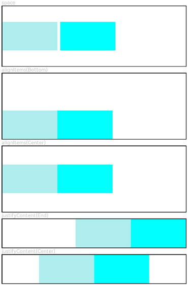
The <Row> component lays out child components horizontally.
NOTE
This component is supported since API version 7. Updates will be marked with a superscript to indicate their earliest API version.
Child Components
Supported
APIs
Row(value?:{space?: number | string })
This API can be used in ArkTS widgets since API version 9.
Parameters
| Name | Type | Mandatory | Description |
|---|---|---|---|
| space | number | string | No | Horizontal spacing between two adjacent child components. Since API version 9, this parameter does not take effect when it is set to a negative number or when justifyContent is set to FlexAlign.SpaceBetween, FlexAlign.SpaceAround or FlexAlign.SpaceEvenly. Default value: 0, in vp NOTE The value can be a number greater than or equal to 0 or a string that can be converted to a number. |
Attributes
| Name | Type | Description |
|---|---|---|
| alignItems | VerticalAlign | Alignment mode of child components in the vertical direction. Default value: VerticalAlign.Center This API can be used in ArkTS widgets since API version 9. |
| justifyContent | FlexAlign | Alignment mode of the child components in the horizontal direction. Default value: FlexAlign.Start This API can be used in ArkTS widgets since API version 9. |
NOTE
During row layout, child components do not shrink if flexShrink is not set for them. In this case, the total size of the child components on the main axis can exceed the size of the container on the main axis.
Example
// xxx.ets
@Entry
@Component
struct RowExample {
  build() {
    Column({ space: 5 }) {
      // Set the horizontal spacing between two adjacent child components to 5.
      Text('space').width('90%')
      Row({ space: 5 }) {
        Row().width('30%').height(50).backgroundColor(0xAFEEEE)
        Row().width('30%').height(50).backgroundColor(0x00FFFF)
      }.width('90%').height(107).border({ width: 1 })

      // Set the alignment mode of the child components in the vertical direction.
      Text('alignItems(Bottom)').width('90%')
      Row() {
        Row().width('30%').height(50).backgroundColor(0xAFEEEE)
        Row().width('30%').height(50).backgroundColor(0x00FFFF)
      }.width('90%').alignItems(VerticalAlign.Bottom).height('15%').border({ width: 1 })

      Text('alignItems(Center)').width('90%')
      Row() {
        Row().width('30%').height(50).backgroundColor(0xAFEEEE)
        Row().width('30%').height(50).backgroundColor(0x00FFFF)
      }.width('90%').alignItems(VerticalAlign.Center).height('15%').border({ width: 1 })

      // Set the alignment mode of the child components in the horizontal direction.
      Text('justifyContent(End)').width('90%')
      Row() {
        Row().width('30%').height(50).backgroundColor(0xAFEEEE)
        Row().width('30%').height(50).backgroundColor(0x00FFFF)
      }.width('90%').border({ width: 1 }).justifyContent(FlexAlign.End)

      Text('justifyContent(Center)').width('90%')
      Row() {
        Row().width('30%').height(50).backgroundColor(0xAFEEEE)
        Row().width('30%').height(50).backgroundColor(0x00FFFF)
      }.width('90%').border({ width: 1 }).justifyContent(FlexAlign.Center)
    }.width('100%')
  }
}
Column Component
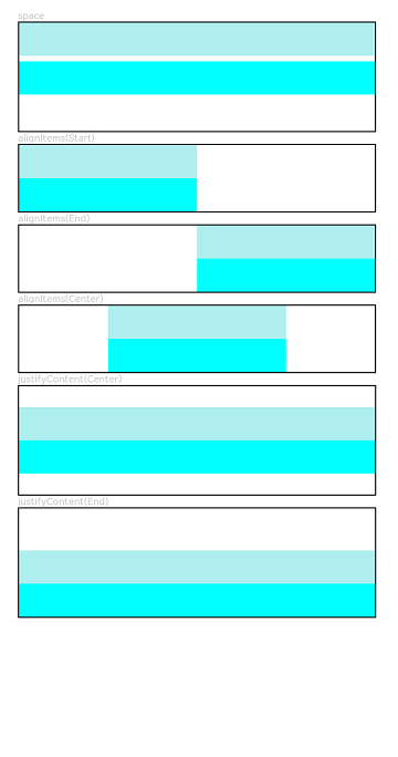
The <Column> component lays out child components vertically.
NOTE
This component is supported since API version 7. Updates will be marked with a superscript to indicate their earliest API version.
Child Components
Supported
APIs
Column(value?: {space?: string | number})
This API can be used in ArkTS widgets since API version 9.
Parameters
| Name | Type | Mandatory | Description |
|---|---|---|---|
| space | string | number | No | Vertical spacing between two adjacent child components. Since API version 9, this parameter does not take effect when it is set to a negative number or when justifyContent is set to FlexAlign.SpaceBetween, FlexAlign.SpaceAround or FlexAlign.SpaceEvenly. Default value: 0 Unit: vp NOTE The value can be a number greater than or equal to 0 or a string that can be converted to a number. |
Attributes
| Name | Type | Description |
|---|---|---|
| alignItems | HorizontalAlign | Alignment mode of the child components in the horizontal direction. Default value: HorizontalAlign.Center This API can be used in ArkTS widgets since API version 9. |
| justifyContent | FlexAlign | Alignment mode of the child components in the vertical direction. Default value: FlexAlign.Start This API can be used in ArkTS widgets since API version 9. |
NOTE
During column layout, child components do not shrink if flexShrink is not set for them. In this case, the total size of the child components on the main axis can exceed the size of the container on the main axis.
Example
// xxx.ets
@Entry
@Component
struct ColumnExample {
  build() {
    Column({ space: 5 }) {
      // Set the vertical spacing between two adjacent child components to 5.
      Text('space').width('90%')
      Column({ space: 5 }) {
        Column().width('100%').height(30).backgroundColor(0xAFEEEE)
        Column().width('100%').height(30).backgroundColor(0x00FFFF)
      }.width('90%').height(100).border({ width: 1 })

      // Set the alignment mode of the child components in the horizontal direction.
      Text('alignItems(Start)').width('90%')
      Column() {
        Column().width('50%').height(30).backgroundColor(0xAFEEEE)
        Column().width('50%').height(30).backgroundColor(0x00FFFF)
      }.alignItems(HorizontalAlign.Start).width('90%').border({ width: 1 })

      Text('alignItems(End)').width('90%')
      Column() {
        Column().width('50%').height(30).backgroundColor(0xAFEEEE)
        Column().width('50%').height(30).backgroundColor(0x00FFFF)
      }.alignItems(HorizontalAlign.End).width('90%').border({ width: 1 })

      Text('alignItems(Center)').width('90%')
      Column() {
        Column().width('50%').height(30).backgroundColor(0xAFEEEE)
        Column().width('50%').height(30).backgroundColor(0x00FFFF)
      }.alignItems(HorizontalAlign.Center).width('90%').border({ width: 1 })

      // Set the alignment mode of the child components in the vertical direction.
      Text('justifyContent(Center)').width('90%')
      Column() {
        Column().width('90%').height(30).backgroundColor(0xAFEEEE)
        Column().width('90%').height(30).backgroundColor(0x00FFFF)
      }.height(100).border({ width: 1 }).justifyContent(FlexAlign.Center)

      Text('justifyContent(End)').width('90%')
      Column() {
        Column().width('90%').height(30).backgroundColor(0xAFEEEE)
        Column().width('90%').height(30).backgroundColor(0x00FFFF)
      }.height(100).border({ width: 1 }).justifyContent(FlexAlign.End)
    }.width('100%').padding({ top: 5 })
  }
}
Custom Component
In ArkUI, components are the visual elements of the interface, divided into built-in components provided by the framework and custom components created by developers. Relying solely on built-in components can lead to rigid, hard-to-maintain designs. Custom components help improve code reusability, separate UI from business logic, and support version upgrades. They offer key features such as:
-
Combinable: Combine built-in and custom components with shared properties and methods.
-
Reusable: Easily reused across different parts of the app.
-
Data-driven updates: Maintain internal state and update the UI when state changes.
Create a Custom Component
Basic Usage of Custom Component
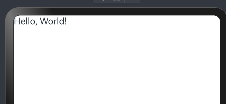
The following example shows the basic usage of a custom component.
 // xxx.ets
@Component
struct HelloComponent {
  @State message: string = 'Hello, World!';

  build() {
    // The HelloComponent custom component combines the <Row> and <Text> built-in components.
    Row() {
      Text(this.message)
        .onClick(() => {
          // The change of the state variable message drives the UI to be re-rendered. As a result, the text changes from "Hello, World!" to "Hello, ArkUI!".
          this.message = 'Hello, ArkUI!';
        })
    }
  }
}
On Previewer, click Hello, World!, the text will change into Hello, ArkUI!.
NOTE
To reference the custom component in another file, use the keyword export to export the component and then use import to import it to the target file.
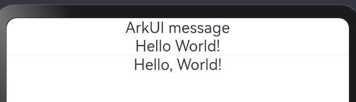
Multiple HelloComponent instances can be created in build() of other custom components. In this way, HelloComponent is reused by those custom components.
@Entry
@Component
struct ParentComponent {
  build() {
    Column() {
      Text('ArkUI message')
      HelloComponent({ message: 'Hello World!' });
      Divider()
      HelloComponent({message: 'Hello, World!'});
    }
  }
}
Basic Structure of a Custom Component
Basic structure are listed below:
-
struct The definition of a custom component must start with the @Component struct followed by the component name, and then component body enclosed by curly brackets. No inheritance is allowed. You can omit the new operator when instantiating a struct.
NOTE
The name or its class or function name of a custom component must be different from that of any built-in components.
-
@Component The @Component decorator can decorate only the structs declared by the struct keyword. When being decorated by @Component, a struct has the componentization capability. You must implement the build function for it to describe the UI. Each struct can be decorated by only one @Component. @Component can accept an optional parameter of the Boolean type.
NOTE
This decorator can be used in ArkTS widgets since API version 9.
An optional parameter of the Boolean type can be used in the @Component since API version 11.
@Component struct MyComponent { } -
The build Function The build function is used to define the declarative UI description of a custom component. Every custom component must define a build function.
@Component struct MyComponent { build() { } } -
@Entry A custom component decorated with @Entry is used as the default entry component of the page. Only one component can be decorated with @Entry in a single page. The @Entry decorator accepts an optional parameter of type LocalStorage.
NOTE
This decorator can be used in ArkTS widgets since API version 9.
Since API version 10, the @Entry decorator accepts an optional parameter of type LocalStorage or type EntryOptions.
This decorator can be used in atomic services since API version 11.
@Entry @Component struct MyComponent { } -
@Reusable Custom components decorated by @Reusable can be reused.
NOTE
This decorator can be used in ArkTS widgets since API version 10.
@Reusable
@Component
struct MyComponent {
}
Rules for Custom Component Parameters
As can be learnt from preceding examples, a custom component can be created from a build method. During the creation, the custom component’s parameters are initialized based on the decorator rules.
@Component
struct MyComponent {
  private countDownFrom: number = 0;
  private color: Color = Color.Blue;

  build() {
  }
}

@Entry
@Component
struct ParentComponent {
  private someColor: Color = Color.Pink;

  build() {
    Column() {
      // Create an instance of MyComponent and initialize its countDownFrom variable with the value 10 and its color variable with the value this.someColor.
      MyComponent({ countDownFrom: 10, color: this.someColor })
    }
  }
}
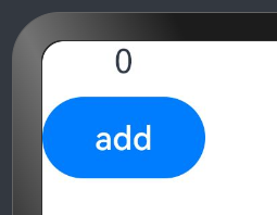
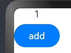
In the following example, a function in the parent component is passed to the child component and called there.
@Entry
@Component
struct Parent {
  @State cnt: number = 0
  submit: () => void = () => {
    this.cnt++;
  }

  build() {
    Column() {
      Text(`${this.cnt}`)
      Son({ submitArrow: this.submit })
    }
  }
}

@Component
struct Son {
  submitArrow?: () => void

  build() {
    Row() {
      Button('add')
        .width(80)
        .onClick(() => {
          if (this.submitArrow) {
            this.submitArrow()
          }
        })
    }
    .height(56)
  }
}
Click the button defined in Son, Text result will be updated in Parent.
Rules in build Function
Whatever declared in build() are called UI descriptions. UI descriptions must comply with the following rules:
- For an @Entry decorated custom component, exactly one root component is required under build(). This root component must be a container component. ForEach is not allowed at the top level. For an @Component decorated custom component, exactly one root component is required under build(). This root component is not necessarily a container component. ForEach is not allowed at the top level.
@Entry @Component struct MyComponent { build() { // Exactly one root component is required, and it must be a container component. Row() { ChildComponent() } } } @Component struct ChildComponent { build() { // Exactly one root component is required, and it is not necessarily a container component. Image('test.jpg') } } -
Local variable declaration is not allowed. The following example should be avoided:
build() { // Avoid: declaring a local variable. let num: number = 1; } -
console.infocan be used in the UI description only when it is in a method or function. The following example should be avoided:build() { // Avoid: using console.info directly in UI description. console.info('print debug log'); } -
Creation of a local scope is not allowed. The following example should be avoided:
build() { // Avoid: creating a local scope. { // ... } } -
Only methods decorated by @Builder can be called. The parameters of built-in components can be the return values of TS methods.
@Component struct ParentComponent { doSomeCalculations() { } calcTextValue(): string { return 'Hello World'; } @Builder doSomeRender() { Text(`Hello World`) } build() { Column() { // Avoid: calling a method not decorated by @Builder. this.doSomeCalculations(); // Prefer: Call an @Builder decorated method. this.doSomeRender(); // Prefer: Pass the return value of a TS method as the parameter. Text(this.calcTextValue()) } } } -
The switch syntax is not allowed. If conditional judgment is required, use the if statement. Refer to the code snippet below.
build() { Column() { // Avoid: using the switch syntax. switch (expression) { case 1: Text('...') break; case 2: Image('...') break; default: Text('...') break; } // Correct usage: Use if. if(expression == 1) { Text('...') } else if(expression == 2) { Image('...') } else { Text('...') } } } -
Expressions are not allowed except for the if component. Refer to the code snippet below.
build() { Column() { // Avoid: expressions. (this.aVar > 10) ? Text('...') : Image('...') // Positive example: Use if for judgment. if(this.aVar > 10) { Text('...') } else { Image('...') } } } -
Directly changing a state variable is not allowed. The following example should be avoided:
@Component
struct MyComponent {
  @State textColor: Color = Color.Yellow;
  @State columnColor: Color = Color.Green;
  @State count: number = 1;
  build() {
    Column() {
      // Avoid: directly changing the value of count in the <Text> component.
      Text(`${this.count++}`)
        .width(50)
        .height(50)
        .fontColor(this.textColor)
        .onClick(() => {
          this.columnColor = Color.Red;
        })
      Button("change textColor").onClick(() =>{
        this.textColor = Color.Pink;
      })
    }
    .backgroundColor(this.columnColor)
  }
}
In ArkUI state management, UI re-render is driven by state.
Therefore, do not change any state variable in the build() or @Builder decorated method of a custom component. Otherwise, loop rendering may result.
Universal Style of a Custom Component
The universal style of a custom component is configured by the chain call.
@Component
struct ChildComponent {
  build() {
    Button(`Hello World`)
  }
}

@Entry
@Component
struct MyComponent {
  build() {
    Row() {
      ChildComponent()
        .width(200)
        .height(300)
        .backgroundColor(Color.Red)
    }
  }
}
NOTE
When ArkUI sets styles for custom components, an invisible container component is set for ChildComponent. These styles are set on the container component instead of the Button component of ChildComponent. As seen from the rendering result, the red background color is not directly applied to the button. Instead, it is applied to the container component that is invisible to users where the button is located.
Page and Custom Component Lifecycle
Before we dive into the page and custom component lifecycle, it would be helpful to learn the relationship between custom components and pages.
-
Custom component: @Component decorated UI unit, which can combine multiple built-in components for component reusability and invoke component lifecycle callbacks.
-
Page: UI page of an application. A page can consist of one or more custom components. A custom component decorated with
@Entryis used as the entry component of the page. Exactly one component is decorated with @Entry in a single source file. Only components decorated by @Entry can invoke the lifecycle callbacks of a page.
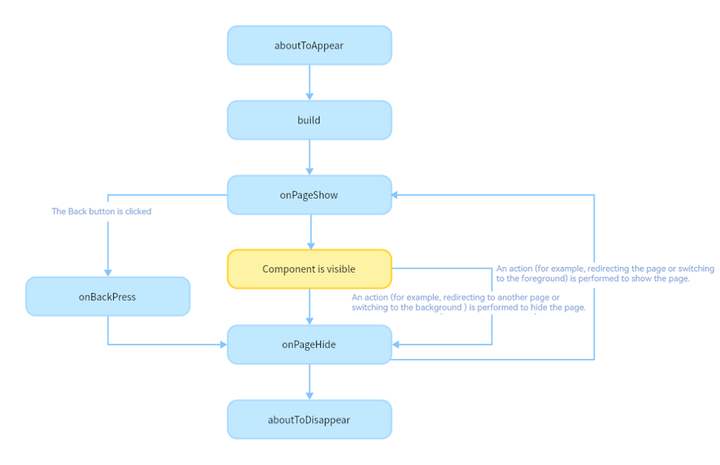
The following lifecycle callbacks are provided for a page, that is, a custom component decorated with @Entry:
-
onPageShow: Invoked each time the page is displayed, for example, during page redirection or when the application is switched to the foreground.
-
onPageHide: Invoked each time the page is hidden, for example, during page redirection or when the application is switched to the background.
-
onBackPress: Invoked when the user clicks the Back button.
The following lifecycle callbacks are provided for a custom component decorated with @Component:
-
aboutToAppear: Invoked when the custom component is about to appear. Specifically, it is invoked after a new instance of the custom component is created and before its build function is executed.
-
aboutToDisappear: Invoked when the custom component is about to be destroyed. Do not change state variables in the aboutToDisappear function as doing this can cause unexpected errors. For example, the modification of the @Link decorated variable may cause unstable application running.
The following figure shows the lifecycle of a component (page) decorated with @Entry.
The following example shows when the lifecycle callbacks are invoked:
// Index.ets
import router from '@ohos.router';

@Entry
@Component
struct MyComponent {
  @State showChild: boolean = true;
  @State btnColor:string = "#FF007DFF"

  // Only components decorated by @Entry can call the lifecycle callbacks of a page.
  onPageShow() {
    console.info('Index onPageShow');
  }
  // Only components decorated by @Entry can call the lifecycle callbacks of a page.
  onPageHide() {
    console.info('Index onPageHide');
  }

  // Only components decorated by @Entry can call the lifecycle callbacks of a page.
  onBackPress() {
    console.info('Index onBackPress');
    this.btnColor ="#FFEE0606"
    return true // The value true means that the page executes its own return logic instead of the , and false (default) means that the default return logic is used.
  }

  // Component lifecycle
  aboutToAppear() {
    console.info('MyComponent aboutToAppear');
  }

  // Component lifecycle
  aboutToDisappear() {
    console.info('MyComponent aboutToDisappear');
  }

  build() {
    Column() {
      // When this.showChild is true, create the Child child component and invoke Child aboutToAppear.
      if (this.showChild) {
        Child()
      }
      // When this.showChild is false, delete the Child child component and invoke Child aboutToDisappear.
      Button('delete Child')
      .margin(20)
      .backgroundColor(this.btnColor)
      .onClick(() => {
        this.showChild = false;
      })
      // Push to the page and execute onPageHide.
      Button('push to next page')
        .onClick(() => {
          router.pushUrl({ url: 'pages/page' });
        })
    }

  }
}

@Component
struct Child {
  @State title: string = 'Hello World';
  // Component lifecycle
  aboutToDisappear() {
    console.info('[lifeCycle] Child aboutToDisappear')
  }

  aboutToAppear() {
    console.info('[lifeCycle] Child aboutToAppear')
  }

  build() {
    Text(this.title).fontSize(50).margin(20).onClick(() => {
      this.title = 'Hello ArkUI';
    })
  }
}
// page.ets
@Entry
@Component
struct page {
  @State textColor: Color = Color.Black;
  @State num: number = 0

  onPageShow() {
    this.num = 5
  }

  onPageHide() {
    console.log("page onPageHide");
  }

  onBackPress() {// If the value is not set, false is used.
    this.textColor = Color.Grey
    this.num = 0
  }

  aboutToAppear() {
    this.textColor = Color.Blue
  }

  build() {
    Column() {
      Text (`num: ${this.num}`)
        .fontSize(30)
        .fontWeight(FontWeight.Bold)
        .fontColor(this.textColor)
        .margin(20)
        .onClick(() => {
          this.num += 5
        })
    }
    .width('100%')
  }
}
In the preceding example, the Index page contains two custom components. One is MyComponent decorated with @Entry, which is also the entry component (root node) of the page. The other is Child, which is a child component of MyComponent. Only components decorated by @Entry can call the page lifecycle callbacks. Therefore, the lifecycle callbacks of the Index page – onPageShow, onPageHide, and onBackPress, are declared in MyComponent. In MyComponent and its child components, component lifecycle callbacks – aboutToAppear and aboutToDisappear – are also declared.
-
The initialization process of application cold start is as follows: MyComponent aboutToAppear -> MyComponent build -> Child aboutToAppear -> Child build -> Child build execution completed -> MyComponent build execution completed -> Index onPageShow
-
When delete Child is clicked, the value of this.showChild linked to if changes to false. As a result, the Child component is deleted, and the Child aboutToDisappear callback is invoked.
-
When push to next page is clicked, the router.pushUrl API is called to jump to the next page. As a result, the Index page is hidden, and the Index onPageHide callback is invoked. As the called API is router.pushUrl, which results in the Index page being hidden, but not destroyed, only the onPageHide callback is invoked. After a new page is displayed, the process of initializing the lifecycle of the new page is executed.
-
If router.replaceUrl is called, the Index page is destroyed. In this case, the execution of lifecycle callbacks changes to: Index onPageHide -> MyComponent aboutToDisappear -> Child aboutToDisappear. As aforementioned, a component is destroyed by directly removing it from the component tree. Therefore, aboutToDisappear of the parent component is called first, followed by aboutToDisappear of the child component, and then the process of initializing the lifecycle of the new page is executed.
-
When the Back button is clicked, the Index onBackPress callback is invoked, and the current Index page is destroyed.
-
When the application is minimized or switched to the background, the Index onPageHide callback is invoked. As the current Index page is not destroyed, aboutToDisappear of the component is not executed. When the application returns to the foreground, the Index onPageShow callback is invoked.
-
When the application exits, the following callbacks are executed in order: Index onPageHide -> MyComponent aboutToDisappear -> Child aboutToDisappear.
More Usage
State Management
In previous examples, most of the pages built are static pages, which are delivered to the end user without having to be processed. If you are building dynamic, interactive pages, you need to handle state management.
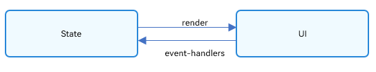
Figure 1: State managed UI
In the preceding example, the interaction between the user and the application triggers an update in the text state, which in turn triggers re-rendering of the UI. As a result, the Hello World text changes to Hello ArkUI.
In a declarative UI framework, the UI is the result of the application’s runtime state. You define a UI model with the state as a parameter, and when the state changes, the UI updates accordingly. This update process is known as the state management mechanism in ArkUI.
For custom components, any variable that affects the UI must be decorated. Without a decorator, the UI renders only once at initialization and won’t update with changes. The diagram below illustrates the relationship between state and view.
-
View (UI): UI rendering, which is visual representation of the UI description in the build method and @Builder decorated method.
-
State: data that drives the UI to re-render. State data is changed by invoking the event method of the component. The change of the state data triggers the re-rendering of the UI.
Basic Concepts
- State Variables: A variable decorated by a state decorator. Its value change will trigger UI re-renders. For example:
@State num: number = 1; // 'num' is the state variable, '@State' is the decorator. - Regular Variables: A variable that is not decorated by a state decorator and is usually used for auxiliary calculation. Its value change will not trigger UI re-renders. In the following example, the increaseBy variable is a regular variable:
private increaseBy: number = 1; // 'increaseBy' is a regular variable. - Data Sources/Synchronization Sources: Original source of a state variable, which can be synchronized to different state data. Generally, it is the data passed from the parent component to the child component. For example:
count: 1; // 'count' is the data source. - Named Argument Mechanism: A mechanism where the parent component passes state variables to the child component by specifying parameters. It is the primary means of passing synchronization parameters from the parent component to the child component. Example:
CompA: ({ aProp: this.aProp }); - Initialization from Parent Component: A process where the parent component uses the named parameter mechanism to pass specified parameters to the child component. The default value used in local initialization will be overwritten by the value passed from the parent component. Example:
@Component
struct MyComponent {
  @State count: number = 0;       // State variable
  private increaseBy: number = 1; // Regular variable

  build() { }
}

@Component
struct Parent {
  build() {
    Column() {
      // Initialize from parent, overriding local default values
      MyComponent({ count: 1, increaseBy: 2 })
    }
  }
}
-
Child Component Initialization: A capability to pass state variables to the child component to initialize the corresponding state variables therein. The example is the same as above.
-
Local Initialization: A process where a value is assigned to a variable as its default value in the variable declaration. Example:
@State count: number = 0;
Decorator Overview
ArkUI provides a diverse array of decorators. You can use these decorators to observe state variables changes within a component or globally and pass the changes between different component levels (for example, between parent and child components or grandparent and grandchild components). According to the scope of the state variable, decorators can be roughly classified into the following types:
-
Decorators for managing the state of a
component: implement state management at the component level by allowing for observation of state changes within a component and changes at different component levels. The observation is limited to state changes in the same component tree, that is, on the same page. -
Decorators for managing the state of an
application: implement global state management of an application by allowing for observation of state changes on different pages or even different UIAbility components.
According to the data transfer mode and synchronization type, decorators can also be classified into the following types:
-
Decorators that allow for one-way (read-only) transfer
-
Decorators that allow for two-way (mutable) transfer
The following figure illustrates the decorators. You can use these decorators at your disposal to implement linkage between data and the UI.
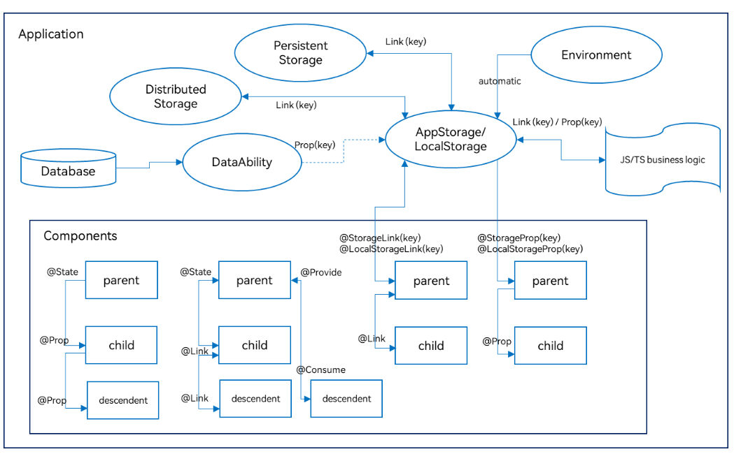
In the preceding figure, the decorators in the components area are used for state management at the component level, while others are used for state management at the application level. You can use @StorageLink/@LocalStorageLink to implement two-way synchronization of the application and component state, and @StorageProp/@LocalStorageProp to implement one-way synchronization.
NOTE
To start, use @State, @Prop and @Link decorator is enough for simple development.
Decorators for component state management
-
@State: An @State decorated variable holds the state of the owning component. It can be the source of one- or two-way synchronization with child components. When the variable changes, the dependent component will be updated.
-
@Prop: An @Prop decorated variable can create one-way synchronization with a variable of its parent component. @Prop decorated variables are mutable, but changes are not synchronized to the parent component.
-
@Link: An @Link decorated variable creates two-way synchronization with a variable of its parent component. When the @Link decorated variable has its value changed, its source is updated as well; when the source updates, the @Link decorated variable will do as well.
-
@Provide/@Consume: Variables decorated by @Provide/@Consume are used for data synchronization across component levels. The components can be bound to the variables through aliases or attribute names. Data does not need to be passed through the named parameter mechanism.
-
@Observed: @Observed is a class decorator. You can use it to decorate the class that has multiple levels of nested objects or arrays to be observed. Note that @Observed must be used with @ObjectLink for two-way synchronization or with @Prop for one-way synchronization.
-
@ObjectLink: An @ObjectLink decorated variable is used with an @Observed decorated class of the parent component for two-way data synchronization. It is applicable in scenarios involving multiple levels of nested objects or arrays in the class.
NOTE
Only @Observed/@ObjectLink can be used to observe changes of nested attributes. Other decorators can be used to observe changes of attributes at the first layer only.
Decorators for application state management
-
AppStorage: a special LocalStorage singleton instance. It is an application-wide database bound to the application process and can be linked to components through the @StorageProp and @StorageLink decorators.
-
AppStorage is the hub for application state. Data that needs to interact with components (UI) is stored in AppStorage, including PersistentStorage and Environment data. The UI accesses the data through the decorators or APIs provided by AppStorage.
-
LocalStorage: an in-memory “database” for the application state declared by the application and typically used to share state across pages. It can be linked to the UI through the @LocalStorageProp and @LocalStorageLink decorators.
Other State Management Features
@Watch: listens for the changes of state variables.
$$operator: provides a TS variable by-reference to a built-in component so that the variable value and the internal state of that component are kept in sync.
Event Binding
Universal Events
This tutorial will introduce Touchscreen Event only, you can redirect the link to learn more like Focus Event and Keyboard and Mouse Event.
Touchscreen events are events triggered when a finger or stylus is placed on, moved along, or lifted from a component. Events like click event, touch event are most often used.
Click Event
A click event is triggered when a complete press and lift action is performed by using a finger or a stylus. When a click event occurs, the following callback is triggered:
onClick(event: (event?: ClickEvent) => void)
The event parameter provides the coordinates of the click relative to the window or component as well as the event source where the click occurs, for example, a button, a click on which shows or hides an image.
@Entry
@Component
struct IfElseTransition {
@State flag: boolean = true;
@State btnMsg: string = 'show';
build() {
Column() {
Button(this.btnMsg).width(80).height(30).margin(30)
.onClick(() => {
if (this.flag) {
this.btnMsg = 'hide';
} else {
this.btnMsg = 'show';
}
// Click the button to show or hide the image.
this.flag = !this.flag;
})
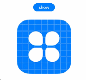
if (this.flag) {
Image($r('app.media.icon')).width(200).height(200)
}
}.height('100%').width('100%')
}
}
Figure 1 Showing or hiding an image through the click event of a button
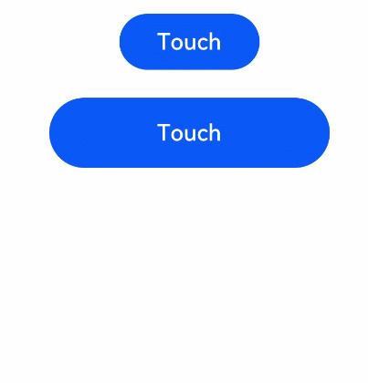
Touch Event
A touch event is triggered when a finger or stylus is placed on, moved along, or lifted from a component.
onTouch(event: (event?: TouchEvent) => void)
-
If event.type is TouchType.Down, the finger or stylus is placed on the component.
-
If event.type is TouchType.Up, the finger or stylus is lifted from the component.
-
If event.type is TouchType.Move, the finger or stylus is moved along the component.
The touch event supports single and multi-touch interactions. Information about the touch event can be obtained using the event parameter, such as the location of the finger that triggers the event, unique identifier of the finger, finger information changed, and the input device source.
// xxx.ets
@Entry
@Component
struct TouchExample {
  @State text: string = '';
  @State eventType: string = '';

  build() {
    Column() {
      Button('Touch').height(40).width(100)
        .onTouch((event?: TouchEvent) => {
          if(event){
            if (event.type === TouchType.Down) {
              this.eventType = 'Down';
            }
            if (event.type === TouchType.Up) {
              this.eventType = 'Up';
            }
            if (event.type === TouchType.Move) {
              this.eventType = 'Move';
            }
            this.text = 'TouchType:' + this.eventType + '\nDistance between touch point and touch element:\nx: '
            + event.touches[0].x + '\n' + 'y: ' + event.touches[0].y + '\nComponent globalPos:('
            + event.target.area.globalPosition.x + ',' + event.target.area.globalPosition.y + ')\nwidth:'
            + event.target.area.width + '\nheight:' + event.target.area.height
          }
        })
      Button('Touch').height(50).width(200).margin(20)
        .onTouch((event?: TouchEvent) => {
          if(event){
            if (event.type === TouchType.Down) {
              this.eventType = 'Down';
            }
            if (event.type === TouchType.Up) {
              this.eventType = 'Up';
            }
            if (event.type === TouchType.Move) {
              this.eventType = 'Move';
            }
            this.text = 'TouchType:' + this.eventType + '\nDistance between touch point and touch element:\nx: '
            + event.touches[0].x + '\n' + 'y: ' + event.touches[0].y + '\nComponent globalPos:('
            + event.target.area.globalPosition.x + ',' + event.target.area.globalPosition.y + ')\nwidth:'
            + event.target.area.width + '\nheight:' + event.target.area.height
          }
        })
      Text(this.text)
    }.width('100%').padding(30)
  }
}
Gesture Events
You can bind to each component different gesture events and design the logic for responding to these events. When a gesture is successfully recognized, the ArkUI framework notifies the component of the gesture recognition result through event callback.
gesture (Common Gesture Binding Method)
.gesture(gesture: GestureType, mask?: GestureMask)
gesture is a frequently used API for binding a gesture to a component.
We don’t expand it in this tutorial but you can check some examples here if interested.
Rendering Control
Overview
ArkUI uses the build() function of custom components and declarative UI description statements in the @builder decorator to build the corresponding UI. In declarative description statements, you can use rendering control statements in addition to system components to accelerate UI construction.
These rendering control statements includes:
- Conditional statements that control whether components are displayed
- Loop statements for repeated content that quickly generate components based on array data
- Lazy loading statements for scenarios involving a large amount of data.
if/else: Conditional Rendering
ArkTS provides conditional rendering. It supports the use of the if, else, and else if statements to display different content based on the application state.
NOTE
This API can be used in ArkTS widgets since API version 9.
Rules of Use
-
The if, else, and else if statements are supported.
-
The conditional statements following if and else if can use state variables.
-
Conditional statements can be used within a container component to build different child components.
-
Conditional statements are “transparent” when it comes to the parent-child relationship of components. Rules about permissible child components must be followed when there is one or more if statements between the parent and child components.
-
The build function inside each conditional branch must follow the special rules for build functions. Each of such build functions must create one or more components. An empty build function that creates no components will result in a syntax error.
-
Some container components impose restrictions on the type or number of child components. When conditional statements are used in such components, these restrictions also apply to the components to be created by using the conditional statements. For example, when a conditional statement is used in the <Grid> container component, whose child components can only be <GridItem>, only the <GridItem> component can be used in the conditional statement.
Update Mechanism
A conditional statement updates whenever a state variable used inside the if or else if condition changes. Specifically:
-
The conditional statement re-evaluates the conditions. If the evaluation of the conditions changes, steps 2 and 3 are performed. Otherwise, no follow-up operation is required.
-
The ArkUI framework removes all child components that have been built.
-
The ArkUI framework executes the build function of the conditional branch again to add the generated child component to its parent component. If an applicable else branch is missing, no new build function will be executed.
A condition can include Typescript expressions. As for any expression inside build functions, such an expression must not change any application state.
Use Scenarios
Using if for Conditional Rendering
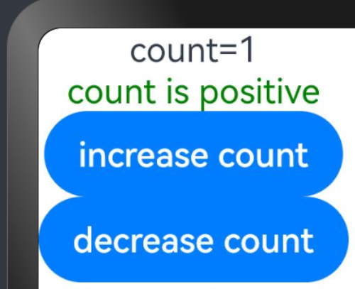
@Entry
@Component
struct ViewA {
  @State count: number = 0;

  build() {
    Column() {
      Text(`count=${this.count}`)

      if (this.count > 0) {
        Text(`count is positive`)
          .fontColor(Color.Green)
      }

      Button('increase count')
        .onClick(() => {
          this.count++;
        })

      Button('decrease count')
        .onClick(() => {
          this.count--;
        })
    }
  }
}
Each branch of the if statement includes a build function. Each of such build functions must create one or more components. On initial render, if will execute a build function and add the generated child component to its parent component.
if updates whenever a state variable used inside the if or else if condition changes, and re-evaluates the conditions. If the evaluation of the conditions changes, it means that another branch of if needs to be built. In this case, the ArkUI framework will:
-
Remove all previously rendered components (of the earlier branch).
-
Execute the build function of the branch and add the generated child component to its parent component.
In the preceding example, if count increases from 0 to 1, then if updates, the condition count > 0 is re-evaluated, and the evaluation result changes from false to true. Therefore, the positive branch build function will be executed, which creates a <Text> component and adds it to the <Column> parent component. If count changes back to 0 later, then the <Text> component will be removed from the <Column> component. Since there is no else branch, no new build function will be executed.
Here is a preview of the example:
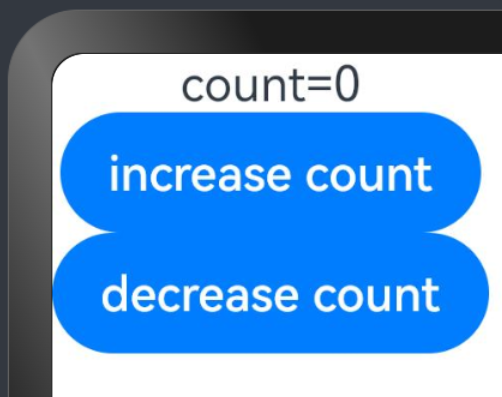
Click increase count, ‘count is positive’ will appear on the Previewer.
if … else … and Child Component States
This example involves if… else… and a child component with an @State decorated variable.
@Component
struct CounterView {
  @State counter: number = 0;
  label: string = 'unknown';

  build() {
    Row() {
      Text(`${this.label}`)
      Button(`counter ${this.counter} +1`)
        .onClick(() => {
          this.counter += 1;
        })
    }
  }
}

@Entry
@Component
struct MainView {
  @State toggle: boolean = true;

  build() {
    Column() {
      if (this.toggle) {
        CounterView({ label: 'CounterView #positive' })
      } else {
        CounterView({ label: 'CounterView #negative' })
      }
      Button(`toggle ${this.toggle}`)
        .onClick(() => {
          this.toggle = !this.toggle;
        })
    }
  }
}
On first render, the CounterView (label: ‘CounterView #positive’) child component is created. This child component carries the @State decorated variable, named counter. When the CounterView.counter state variable is updated, the CounterView (label: ‘CounterView #positive’) child component is re-rendered, with its state variable value preserved. When the value of the MainView.toggle state variable changes to false, the if statement inside the MainView parent component gets updated, and subsequently the CounterView (label: ‘CounterView #positive’) child component is removed. At the same time, a new CounterView (label: ‘CounterView #negative’) child component is created, with the counter state variable set to the initial value 0.
Here is a preview of the example:
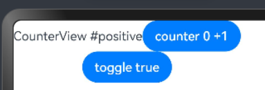
NOTE
CounterView (label: ‘CounterView #positive’) and CounterView (label: ‘CounterView #negative’) are two distinct instances of the same custom component. When the if branch changes, there is no update to an existing child component or no preservation of state.
The following example shows the required modifications if the value of counter needs to be preserved when the if condition changes:
@Component
struct CounterView {
  @Link counter: number;
  label: string = 'unknown';

  build() {
    Row() {
      Text(`${this.label}`)
      Button(`counter ${this.counter} +1`)
        .onClick(() => {
          this.counter += 1;
        })
    }
  }
}

@Entry
@Component
struct MainView {
  @State toggle: boolean = true;
  @State counter: number = 0;

  build() {
    Column() {
      if (this.toggle) {
        CounterView({ counter: $counter, label: 'CounterView #positive' })
      } else {
        CounterView({ counter: $counter, label: 'CounterView #negative' })
      }
      Button(`toggle ${this.toggle}`)
        .onClick(() => {
          this.toggle = !this.toggle;
        })
    }
  }
}
Here, the @State decorated variable counter is owned by the parent component. Therefore, it is not destroyed when a CounterView component instance is destroyed. The CounterView component refers to the state by an @Link decorator. The state must be moved from a child to its parent (or parent of parent) to avoid losing it when the conditional content (or repeated content) is destroyed.
ForEach: Rendering of Repeated Content
ForEach enables rendering of repeated content based on array type data. It must be used in a container component, and the component it returns must be one allowed inside the container component. For example, for rendering of list items, ForEach must be used in the <List> component.
NOTE
This API is supported in ArkTS widgets since API version 9.
Interface Description
ForEach(
  arr: Array,
  itemGenerator: (item: Object, index: number) => void,
  keyGenerator?: (item: Object, index: number) => string
)
The parameters are described in the table below.
| Name | Type | Mandatory | Description |
|---|---|---|---|
| arr | Array<Object> | Yes | Data source, which is an array. NOTE - You can set this parameter to an empty array. In this case, no child component is created. - You can also set this parameter to a function whose return value is an array, for example, arr.slice (1, 3). However, the set function cannot change any state variables including the array itself. For example, Array.splice, Array.sort, and Array.reverse functions are not allowed, as they may change the array. |
| itemGenerator | (item: Object, index: number) => void | Yes | Component generator. - It generates a component for each data item in an array. - item: data item in the arr array. - (Optional) index: index of the data item in the arr array. NOTE - The type of the created component must be the one allowed inside the parent container component of ForEach. For example, a <ListItem> component is allowed only when the parent container component of ForEach is <List>. |
| keyGenerator | (item: Object, index: number) => string | No | Key generator. - It generates a unique and persistent key for each array item of the data source arr. The return value is the key generation rule you customize. - item: data item in the arr array. - (Optional) index: index of the data item in the arr array. NOTE - If this function is not specified, the default key generator of the framework is used: (item: T, index: number) => { return index + ‘__’ + JSON.stringify(item); }. - The key generator should not change any component state. |
NOTE
- The itemGenerator function can contain an if/else statement, and an if/else statement can contain ForEach.
- On initial rendering, ForEach loads all data of the data source, creates a component for each data item, and mounts the created components to the render tree. If the data source contains a large number of items or performance is a critical concern, you are advised to use LazyForEach.
Key Generation Rules
- During ForEach rendering, the system generates a unique, persistent key for each array item to identify the corresponding component. When the key changes, the ArkUI framework considers that the array element has been replaced or modified and creates a new component based on the new key.
- ForEach provides a parameter named keyGenerator, which is in effect a function through which you can customize key generation rules. If no keyGenerator function is defined, the ArkUI framework uses the default key generator, that is, (item: Object, index: number) => { return index + ‘__’ + JSON.stringify(item); }.
- The ArkUI framework has a set of specific judgment rules for ForEach key generation, which are mainly associated with the second parameter index of the itemGenerator function and the second parameter index of the keyGenerator function. The following figure shows the logic of the key generation rules.
NOTE
The ArkUI framework warns of duplicate keys. If duplicate keys exist during UI re-rendering, the framework may not work properly.
Component Creation Rules
After the key generation rules are determined, the itemGenerator function – the second parameter in ForEach – creates a component for each array item of the data source based on the rules. There are two cases for creating a component: initial rendering and non-initial rendering.
Initial Rendering
When used for initial rendering, ForEach generates a unique key for each array item of the data source based on the key generation rules, and creates a component.
@Entry
@Component
struct Parent {
  @State simpleList: Array<string> = ['one', 'two', 'three'];

  build() {
    Row() {
      Column() {
        ForEach(this.simpleList, (item: string) => {
          ChildItem({ item: item })
        }, (item: string) => item)
      }
      .width('100%')
      .height('100%')
    }
    .height('100%')
    .backgroundColor(0xF1F3F5)
  }
}

@Component
struct ChildItem {
  @Prop item: string;

  build() {
    Text(this.item)
      .fontSize(50)
  }
}
The figure below shows the effect.
Figure 1 Initial rendering when the ForEach data sources do not have the same key

In the preceding code snippets, the key generation rule is the return value item of the keyGenerator function. During ForEach rendering, keys (one, two, and three) are generated in sequence for data source array items, and corresponding child items are created and rendered to the UI.
When the keys generated for different data items are the same, the behavior of the framework is unpredictable. For example, in the following code, when data items with the same key two are rendered by ForEach, only one ChildItem component, instead of multiple components with the same key, is created.
 @Entry
 @Component
 struct Parent {
   @State simpleList: Array<string> = ['one', 'two', 'two', 'three'];

   build() {
     Row() {
       Column() {
         ForEach(this.simpleList, (item: string) => {
           ChildItem({ item: item })
         }, (item: string) => item)
       }
       .width('100%')
       .height('100%')
     }
     .height('100%')
     .backgroundColor(0xF1F3F5)
   }
 }

 @Component
 struct ChildItem {
   @Prop item: string;

   build() {
     Text(this.item)
       .fontSize(50)
   }
 }
The figure below shows the effect.
Figure 2 Initial rendering when the ForEach data sources have the same key

In this example, the final key value generation rule is item. When ForEach traverses the data source simpleList and finds the key two whose index is 1, ForEach creates a component whose key is two based on the final key value generation rule and marks the component. When ForEach finds the key two whose index is 2, it does not create a component, because the key of the current item is also two according to the final key generation rule.
Non-Initial Rendering
When ForEach is used for re-rendering (non-initial rendering), it checks whether the newly generated key already exists in the previous rendering. If the key does not exist, a new component is created. If the key exists, no new component is created; instead, the component corresponding to the key is re-rendered. For example, in the following code snippet, the value of the third item of the array is changed to “new three” through the click event, which triggers ForEach to perform re-rendering.
@Entry
@Component
struct Parent {
  @State simpleList: Array<string> = ['one', 'two', 'three'];

  build() {
    Row() {
      Column() {
        Text('Change Value of Third Array Item')
          .fontSize(24)
          .fontColor(Color.Red)
          .onClick(() => {
            this.simpleList[2] = 'new three';
          })

        ForEach(this.simpleList, (item: string) => {
          ChildItem({ item: item })
            .margin({ top: 20 })
        }, (item: string) => item)
      }
      .justifyContent(FlexAlign.Center)
      .width('100%')
      .height('100%')
    }
    .height('100%')
    .backgroundColor(0xF1F3F5)
  }
}

@Component
struct ChildItem {
  @Prop item: string;

  build() {
    Text(this.item)
      .fontSize(30)
  }
}
The figure below shows the effect.
Figure 3 Re-rendering with ForEach
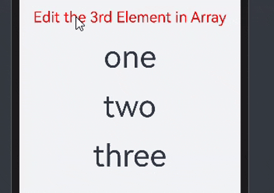
From this example, you can see that @State can observe changes in the primitive array items of the simpleList data source.
- When any array item in simpleList changes, ForEach is triggered for re-rendering.
- ForEach traverses the new data source [‘one’, ‘two’, ‘new three’] and generates the corresponding keys one, two, and new three.
- Because keys one and two already exist in the previous rendering, ForEach reuses the corresponding components and re-renders them. For the third array item “new three”, because a new key new three is generated for it based on the key generation rule item, ForEach creates a new component for it.
Use Cases
ForEach is typically used in several cases:
- data source unchanged
- data source changed (for example, when array items are inserted or deleted)
- properties of data source array items changed
Data Source Unchanged
If the data source remains unchanged, it can of a primitive data type. For example, when a page is loading, the skeleton screen may be used.
@Entry
@Component
struct ArticleList {
  @State simpleList: Array<number> = [1, 2, 3, 4, 5];

  build() {
    Column() {
      ForEach(this.simpleList, (item: number) => {
        ArticleSkeletonView()
          .margin({ top: 20 })
      }, (item: number) => item.toString())
    }
    .padding(20)
    .width('100%')
    .height('100%')
  }
}

@Builder
function textArea(width: number | Resource | string = '100%', height: number | Resource | string = '100%') {
  Row()
    .width(width)
    .height(height)
    .backgroundColor('#FFF2F3F4')
}

@Component
struct ArticleSkeletonView {
  build() {
    Row() {
      Column() {
        textArea(80, 80)
      }
      .margin({ right: 20 })

      Column() {
        textArea('60%', 20)
        textArea('50%', 20)
      }
      .alignItems(HorizontalAlign.Start)
      .justifyContent(FlexAlign.SpaceAround)
      .height('100%')
    }
    .padding(20)
    .borderRadius(12)
    .backgroundColor('#FFECECEC')
    .height(120)
    .width('100%')
    .justifyContent(FlexAlign.SpaceBetween)
  }
}
The figure below shows the effect.
Figure 4 Skeleton screen
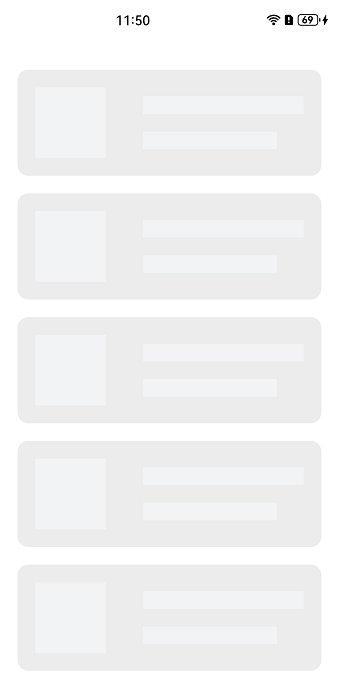
In this example, the data item item is used as the key generation rule. Because the array items of the data source simpleList are different, the uniqueness of the keys can be ensured.
Data Source Changed
If data source array item changes, for example, when an array item is inserted or deleted, or has its index changed, the data source should be of the object array type, and a unique ID of the object is used as the final key. For example, after a pull-to-refresh gesture is performed, newly obtained data items are added to the tail of the data source array, resulting in an increase in the length of the data source array.
class Article {
  id: string;
  title: string;
  brief: string;

  constructor(id: string, title: string, brief: string) {
    this.id = id;
    this.title = title;
    this.brief = brief;
  }
}

@Entry
@Component
struct ArticleListView {
  @State isListReachEnd: boolean = false;
  @State articleList: Array<Article> = [
    new Article('001','Article 1','Abstract'),
    new Article('002','Article 2','Abstract'),
    new Article('003','Article 3','Abstract'),
    new Article('004','Article 4','Abstract'),
    new Article('005','Article 5','Abstract'),
    new Article ('006','Article 6','Abstract')
  ]

  loadMoreArticles() {
    this.articleList.push(new Article('007','New article','Abstract');
  }

  build() {
    Column({ space: 5 }) {
      List() {
        ForEach(this.articleList, (item: Article) => {
          ListItem() {
            ArticleCard({ article: item })
              .margin({ top: 20 })
          }
        }, (item: Article) => item.id)
      }
      .onReachEnd(() => {
        this.isListReachEnd = true;
      })
      .parallelGesture(
        PanGesture({ direction: PanDirection.Up, distance: 80 })
          .onActionStart(() => {
            if (this.isListReachEnd) {
              this.loadMoreArticles();
              this.isListReachEnd = false;
            }
          })
      )
      .padding(20)
      .scrollBar(BarState.Off)
    }
    .width('100%')
    .height('100%')
    .backgroundColor(0xF1F3F5)
  }
}

@Component
struct ArticleCard {
  @Prop article: Article;

  build() {
    Row() {
      Image($r('app.media.icon'))
        .width(80)
        .height(80)
        .margin({ right: 20 })

      Column() {
        Text(this.article.title)
          .fontSize(20)
          .margin({ bottom: 8 })
        Text(this.article.brief)
          .fontSize(16)
          .fontColor(Color.Gray)
          .margin({ bottom: 8 })
      }
      .alignItems(HorizontalAlign.Start)
      .width('80%')
      .height('100%')
    }
    .padding(20)
    .borderRadius(12)
    .backgroundColor('#FFECECEC')
    .height(120)
    .width('100%')
    .justifyContent(FlexAlign.SpaceBetween)
  }
}
The following figure shows the initial screen (on the left) and the screen after a pull-to-refresh gesture (on the right).
Figure 5 When the data source is changed
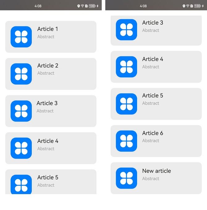
In this example, the ArticleCard component functions as a child component of the ArticleListView component and receives an Article object through the @Prop decorator to render article widgets.
- When the list scrolls to the bottom, if the distance of finger movement exceeds the threshold 80, the loadMoreArticle() function is triggered. This function adds a new data item to the tail of the articleList data source, increasing the length of the data source.
- Because the data source is decorated by @State, the ArkUI framework can detect the change of the data source length and trigger ForEach for re-rendering.
Properties of Data Source Array Items Changed
If the data source array items are of the Object type, property changes of these array items cannot be detected by the ArkUI framework, because the framework cannot detect property changes of array items of complex types when the array is decorated by @State. As a result, re-rendering by ForEach is not performed. To trigger ForEach to perform re-rendering, use the @Observed and @ObjectLink decorators. In the following example, clicking the Like icon on the article list changes the number of likes for an article.
@Observed
class Article {
  id: string;
  title: string;
  brief: string;
  isLiked: boolean;
  likesCount: number;

  constructor(id: string, title: string, brief: string, isLiked: boolean, likesCount: number) {
    this.id = id;
    this.title = title;
    this.brief = brief;
    this.isLiked = isLiked;
    this.likesCount = likesCount;
  }
}

@Entry
@Component
struct ArticleListView {
  @State articleList: Array<Article> = [
    new Article('001','Article 0','Abstract', false, 100),
    new Article('002','Article 1','Abstract', false, 100),
    new Article('003','Article 2','Abstract', false, 100),
    new Article('004','Article 4','Abstract', false, 100),
    new Article('005','Article 5','Abstract', false, 100),
    new Article('006','Article 6','Abstract', false, 100),
  ];

  build() {
    List() {
      ForEach(this.articleList, (item: Article) => {
        ListItem() {
          ArticleCard({
            article: item
          })
            .margin({ top: 20 })
        }
      }, (item: Article) => item.id)
    }
    .padding(20)
    .scrollBar(BarState.Off)
    .backgroundColor(0xF1F3F5)
  }
}

@Component
struct ArticleCard {
  @ObjectLink article: Article;

  handleLiked() {
    this.article.isLiked = !this.article.isLiked;
    this.article.likesCount = this.article.isLiked ? this.article.likesCount + 1 : this.article.likesCount - 1;
  }

  build() {
    Row() {
      Image($r('app.media.icon'))
        .width(80)
        .height(80)
        .margin({ right: 20 })

      Column() {
        Text(this.article.title)
          .fontSize(20)
          .margin({ bottom: 8 })
        Text(this.article.brief)
          .fontSize(16)
          .fontColor(Color.Gray)
          .margin({ bottom: 8 })

        Row() {
          Image(this.article.isLiked ? $r('app.media.iconLiked') : $r('app.media.iconUnLiked'))
            .width(24)
            .height(24)
            .margin({ right: 8 })
          Text(this.article.likesCount.toString())
            .fontSize(16)
        }
        .onClick(() => this.handleLiked())
        .justifyContent(FlexAlign.Center)
      }
      .alignItems(HorizontalAlign.Start)
      .width('80%')
      .height('100%')
    }
    .padding(20)
    .borderRadius(12)
    .backgroundColor('#FFECECEC')
    .height(120)
    .width('100%')
    .justifyContent(FlexAlign.SpaceBetween)
  }
}
The following figure shows the initial screen (on the left) and the screen after the Like icon of Article 1 is clicked (on the right).
Figure 6 When properties of data source array items are changed
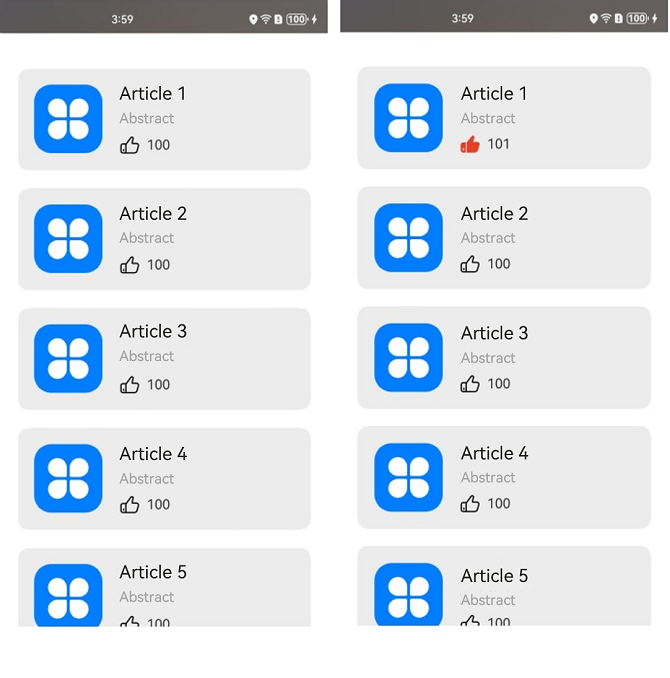
In this example, the Article class is decorated by the @Observed decorator. The parent component ArticleListView passes an Article object instance to the child component ArticleCard, and the child component uses the @ObjectLink decorator to receive the instance.
- When the Like icon of Article 1 is clicked, the handleLiked function of the ArticleCard component is triggered. This function changes the values of the isLiked and likesCount properties of the article instance in the component pertaining to Article 1.
- Because article in the child component ArticleCard uses the @ObjectLink decorator, the parent and child components share the same article data. As such, the values of isLiked and likedCounts of the first array item of articleList in the parent component are changed synchronously.
- When the parent component detects property changes of the data source array items, ForEach is triggered for re-rendering.
- Here, the ForEach key generation rule is the id property value of the array item. If ForEach traverses the new data source and finds no changes in the id values, no component is created.
- When the ArticleCard component corresponding to the first array item is rendered, the obtained values of isLiked and likedCounts are the new values.
Suggestions
- Avoid including the data item index in the final key generation rule to prevent unexpected rendering results and deteriorated rendering performance. If including index is required, for example, when the list needs to be rendered based on the index, prepare for the performance loss resulting from component creation by ForEach to account for data source changes.
- To ensure unique keys for array items of the Object type, you are advised to use the unique IDs of objects as keys.
- Data items of primitive data types do not have a unique ID. If you use the primitive data type itself as the key, you must ensure that the array items are not duplicate. In scenarios where the data source changes, you are advised to convert the array of a primitive data type into an array of the Object type with the id property, and then use the id property as the key generation rule.