@State Decorator
Variables decorated with @State, also known as state variable, are used in our development to declare internal component states. When a property is decorated with @State, it becomes a reactive state of the component. This means that whenever the property’s value changes, the component will automatically re-render to reflect the updated state.
Features
-
A one-way synchronization relationship can be set up from an
@Statedecorated variable to an@Propdecorated variable in a child component, and a two-way synchronization relationship to an@Linkor@ObjectLinkdecorated variable. -
The lifecycle of the
@Statedecorated variable is the same as that of its owning custom component.
Use Scenarios
Decorating Simple Type Variables
Below is a simple counter component to demonstrate how the @State decorator works.
@Entry
@Component
struct MyComponent {
  @State count: number = 0; // State variable

  build() {
    Button(`click times: ${this.count}`)
      .width(200)
      .height(80)
      .fontSize(20)
      .margin(60)
      .onClick(() => {
        this.count += 1; // Increment count on button click
      })
  }
}
In the code above, we define a component named MyComponent, which contains a state variable called count. We declare the count property using the @State decorator, making it a reactive state. When the user clicks the button, the value of count is incremented by 1, and the component automatically re-renders to display the latest count.


Decorating the Class Object Type Variables
-
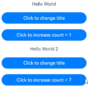
In this example,
@Stateis used to decorate the variables count and title in the custom component MyComponent. The type of title is Model, a custom class. If the value of count or title changes, the framework searches for all MyComponent instances that depend on these variables and triggers re-rendering of them. -
The EntryComponent has multiple MyComponent instances. The internal state change of the first MyComponent instance does not affect the second MyComponent instance.
class Model {
  public value: string;

  constructor(value: string) {
    this.value = value;
  }
}

@Entry
@Component
struct EntryComponent {
  build() {
    Column() {
      // The parameters specified here will overwrite the default values defined locally during initial render. Not all parameters need to be initialized from the parent component.
      MyComponent({ count: 1, increaseBy: 2 })
        .width(300)
      MyComponent({ title: new Model('Hello World 2'), count: 7 })
    }
  }
}

@Component
struct MyComponent {
  @State title: Model = new Model('Hello World');
  @State count: number = 0;
  private increaseBy: number = 1;

  build() {
    Column() {
      Text(`${this.title.value}`)
        .margin(10)
      Button(`Click to change title`)
        .onClick(() => {
          // The update of the @State decorated variable triggers the update of the <Text> component.
          this.title.value = this.title.value === 'Hello ArkUI' ? 'Hello World' : 'Hello ArkUI';
        })
        .width(300)
        .margin(10)

      Button(`Click to increase count = ${this.count}`)
        .onClick(() => {
          // The update of the @State decorated variable triggers the update of the <Button> component.
          this.count += this.increaseBy;
        })
        .width(300)
        .margin(10)
    }
  }
}
Additional Information
For additional information please refer to the ArkTS State Decorator