The declarative UI provides different common layouts like Linear layout, Stack layout, Flex layout and etc.
In this chapter we will focus on Linear Layout, for additional information please refer to layout overview documentation.
- Linear Layout Basic Concepts
- Spacing of Child Elements in Arrangement Direction
- Arrangement of Child Elements Along Main Axis
- Arrangement of Child Elements Along Cross Axis
- Adaptive Stretching
- Adaptive Scaling
- To add: Practice demo
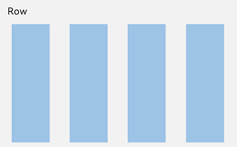
Linear layout is the most frequently used layout in development, built with the Row and Column linear containers. The linear layout is the basis of other layouts. Its child elements are arranged in sequence linearly in the horizontal direction, as in a Row container, or vertical direction, as in a Column container.
Figure 1 Child element arrangement in a Column container
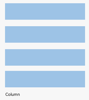
Figure 2 Child element arrangement in a Row container
Basic Concepts
-
Layout container: container component that is able to lay out other elements as its child elements. The layout container calculates the size of its child elements and arranges the layout.
-
Layout child element: element inside the layout container.
-
Main axis: axis along which child elements are laid out by default in the linear layout container. The main axis is horizontal for the **
** container and vertical for the **
** container. -
Cross axis: axis that runs perpendicular to the main axis. The cross axis is vertical for the **
** container and horizontal for the **
** container. -
Spacing: distance between child elements.
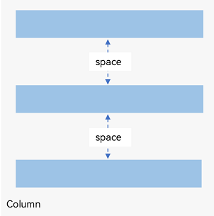
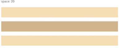
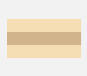
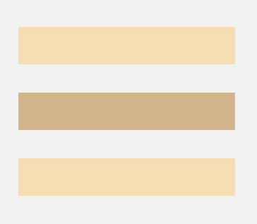
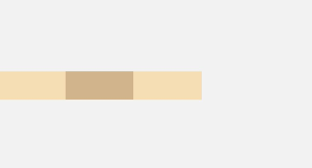
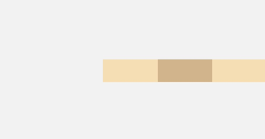
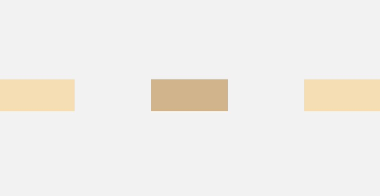
Spacing of Child Elements in Arrangement Direction
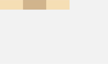
In the layout container, use the space attribute to equally space child elements in the arrangement direction.
In Container
Figure 3 Layout child element spacing in the arrangement direction in the
Column({ space: 20 }) {
  Text('space: 20').fontSize(15).fontColor(Color.Gray).width('90%')
  Row().width('90%').height(50).backgroundColor(0xF5DEB3)
  Row().width('90%').height(50).backgroundColor(0xD2B48C)
  Row().width('90%').height(50).backgroundColor(0xF5DEB3)
}.width('100%')
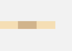
In Container
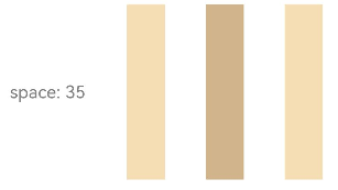
Figure 4 Layout child element spacing in the arrangement direction in the
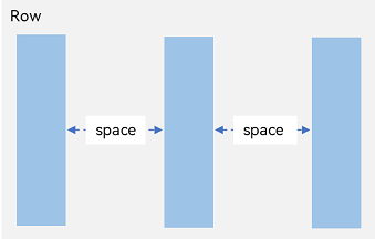
Row({ space: 35 }) {
  Text('space: 35').fontSize(15).fontColor(Color.Gray)
  Row().width('10%').height(150).backgroundColor(0xF5DEB3)
  Row().width('10%').height(150).backgroundColor(0xD2B48C)
  Row().width('10%').height(150).backgroundColor(0xF5DEB3)
}.width('90%')
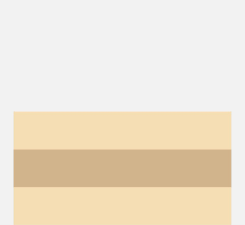
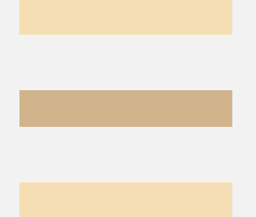
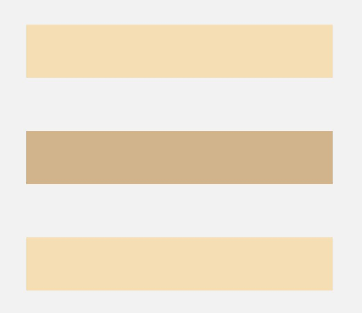
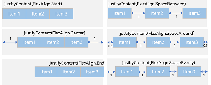
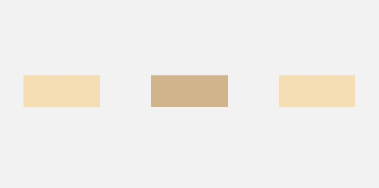
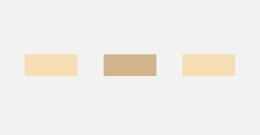
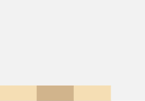
Arrangement of Child Elements Along Main Axis
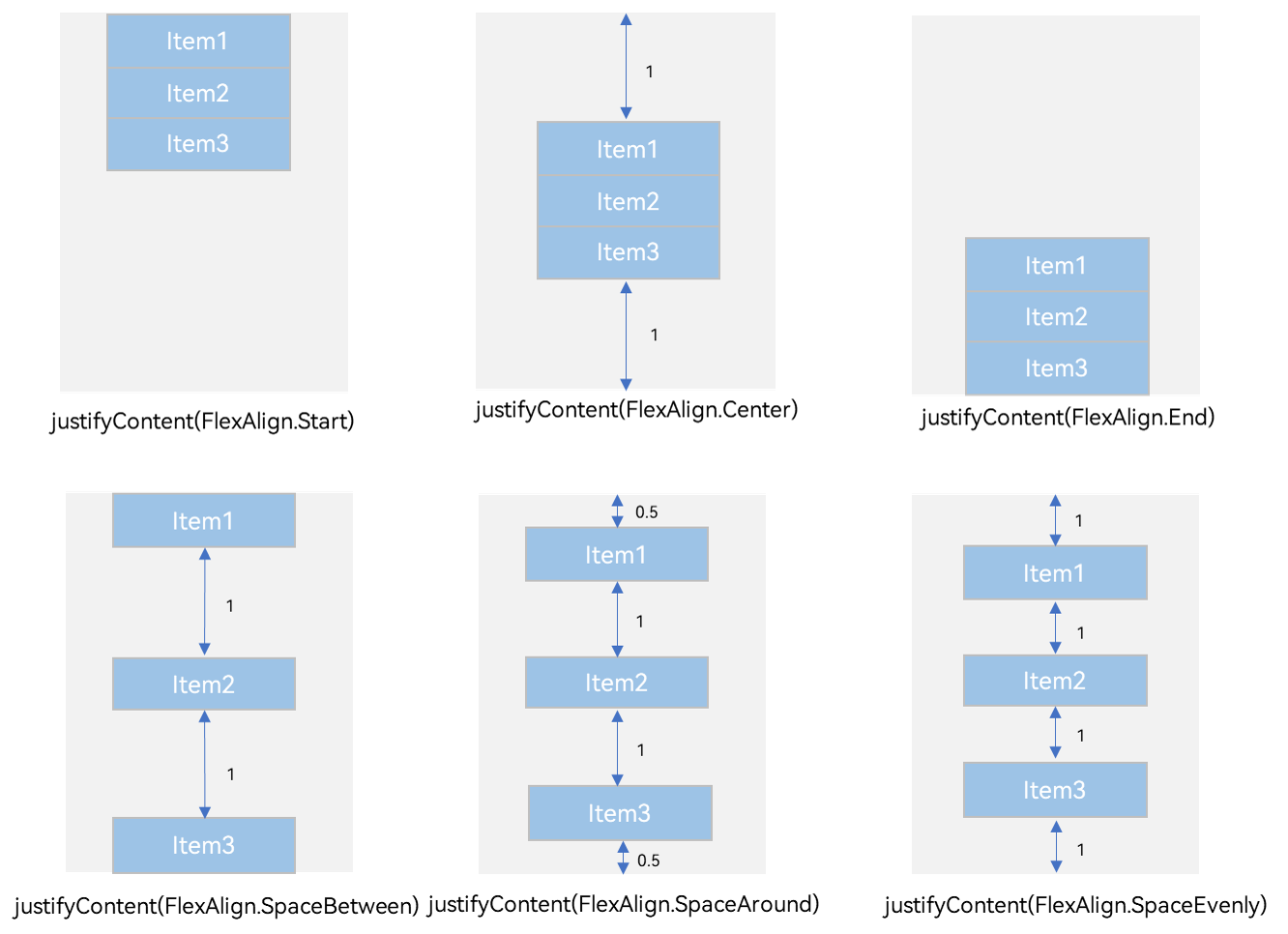
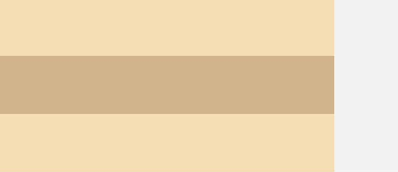
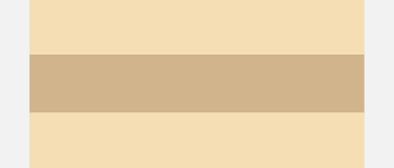
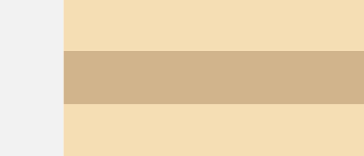
In the layout container, you can use the justifyContent attribute to set the arrangement mode of child elements along the main axis. The arrangement may begin from the start point or end point of the main axis, or the space of the main axis can be evenly divided.
In Container
Figure 5 Vertical alignment of child elements in the
-
justifyContent(FlexAlign.Start): The items are vertically aligned with each other toward the start edge of the container.
Column({}) {
  Column() {
  }.width('80%').height(50).backgroundColor(0xF5DEB3)

  Column() {
  }.width('80%').height(50).backgroundColor(0xD2B48C)

  Column() {
  }.width('80%').height(50).backgroundColor(0xF5DEB3)
}.width('100%').height(300).backgroundColor('rgb(242,242,242)').justifyContent(FlexAlign.Start)
-
justifyContent(FlexAlign.Center): The elements are vertically aligned with each other toward the center of the container. The space between the first component and the start edge is the same as that between the last component and the end edge.
Column({}) {
  Column() {
  }.width('80%').height(50).backgroundColor(0xF5DEB3)

  Column() {
  }.width('80%').height(50).backgroundColor(0xD2B48C)

  Column() {
  }.width('80%').height(50).backgroundColor(0xF5DEB3)
}.width('100%').height(300).backgroundColor('rgb(242,242,242)').justifyContent(FlexAlign.Center)
-
justifyContent(FlexAlign.End): The elements are vertically aligned with each other toward the end edge of the container.
Column({}) {
  Column() {
  }.width('80%').height(50).backgroundColor(0xF5DEB3)

  Column() {
  }.width('80%').height(50).backgroundColor(0xD2B48C)

  Column() {
  }.width('80%').height(50).backgroundColor(0xF5DEB3)
}.width('100%').height(300).backgroundColor('rgb(242,242,242)').justifyContent(FlexAlign.End)
-
justifyContent(FlexAlign.SpaceBetween): The elements are evenly distributed vertically. The space between any two adjacent elements is the same. The first element is aligned with the start edge, the last element is aligned with the end edge, and the remaining elements are distributed so that the space between any two adjacent elements is the same.
Column({}) {
  Column() {
  }.width('80%').height(50).backgroundColor(0xF5DEB3)

  Column() {
  }.width('80%').height(50).backgroundColor(0xD2B48C)

  Column() {
  }.width('80%').height(50).backgroundColor(0xF5DEB3)
}.width('100%').height(300).backgroundColor('rgb(242,242,242)').justifyContent(FlexAlign.SpaceBetween)
-
justifyContent(FlexAlign.SpaceAround): The elements are evenly distributed vertically. The space between any two adjacent elements is the same. The space between the first element and start edge, and that between the last element and end edge are both half the size of the space between two adjacent elements.
Column({}) {
  Column() {
  }.width('80%').height(50).backgroundColor(0xF5DEB3)

  Column() {
  }.width('80%').height(50).backgroundColor(0xD2B48C)

  Column() {
  }.width('80%').height(50).backgroundColor(0xF5DEB3)
}.width('100%').height(300).backgroundColor('rgb(242,242,242)').justifyContent(FlexAlign.SpaceAround)
-
justifyContent(FlexAlign.SpaceEvenly): The elements are evenly distributed vertically. The space between the first element and start edge, the space between the last element and end edge, and the space between any two adjacent elements are the same.
Column({}) {
  Column() {
  }.width('80%').height(50).backgroundColor(0xF5DEB3)

  Column() {
  }.width('80%').height(50).backgroundColor(0xD2B48C)

  Column() {
  }.width('80%').height(50).backgroundColor(0xF5DEB3)
}.width('100%').height(300).backgroundColor('rgb(242,242,242)').justifyContent(FlexAlign.SpaceEvenly)
In Container
Figure 6 Horizontal alignment of child elements in the
-
justifyContent(FlexAlign.Start): The items are horizontally aligned with each other toward the start edge of the container.
Row({}) {
  Column() {
  }.width('20%').height(30).backgroundColor(0xF5DEB3)

  Column() {
  }.width('20%').height(30).backgroundColor(0xD2B48C)

  Column() {
  }.width('20%').height(30).backgroundColor(0xF5DEB3)
}.width('100%').height(200).backgroundColor('rgb(242,242,242)').justifyContent(FlexAlign.Start)
-
justifyContent(FlexAlign.Center): The elements are horizontally aligned with each other toward the center of the container. The space between the first component and the start edge is the same as that between the last component and the end edge.
Row({}) {
  Column() {
  }.width('20%').height(30).backgroundColor(0xF5DEB3)

  Column() {
  }.width('20%').height(30).backgroundColor(0xD2B48C)

  Column() {
  }.width('20%').height(30).backgroundColor(0xF5DEB3)
}.width('100%').height(200).backgroundColor('rgb(242,242,242)').justifyContent(FlexAlign.Center)

-
justifyContent(FlexAlign.End): The elements are horizontally aligned with each other toward the end edge of the container.
Row({}) {
  Column() {
  }.width('20%').height(30).backgroundColor(0xF5DEB3)

  Column() {
  }.width('20%').height(30).backgroundColor(0xD2B48C)

  Column() {
  }.width('20%').height(30).backgroundColor(0xF5DEB3)
}.width('100%').height(200).backgroundColor('rgb(242,242,242)').justifyContent(FlexAlign.End)
-
justifyContent(FlexAlign.SpaceBetween): The elements are evenly distributed horizontally. The space between any two adjacent elements is the same. The first element is aligned with the start edge, the last element is aligned with the end edge, and the remaining elements are distributed so that the space between any two adjacent elements is the same.
Row({}) {
  Column() {
  }.width('20%').height(30).backgroundColor(0xF5DEB3)

  Column() {
  }.width('20%').height(30).backgroundColor(0xD2B48C)

  Column() {
  }.width('20%').height(30).backgroundColor(0xF5DEB3)
}.width('100%').height(200).backgroundColor('rgb(242,242,242)').justifyContent(FlexAlign.SpaceBetween)
-
justifyContent(FlexAlign.SpaceAround): The elements are evenly distributed horizontally. The space between any two adjacent elements is the same. The space between the first element and start edge, and that between the last element and end edge are both half the size of the space between two adjacent elements.
Row({}) {
  Column() {
  }.width('20%').height(30).backgroundColor(0xF5DEB3)

  Column() {
  }.width('20%').height(30).backgroundColor(0xD2B48C)

  Column() {
  }.width('20%').height(30).backgroundColor(0xF5DEB3)
}.width('100%').height(200).backgroundColor('rgb(242,242,242)').justifyContent(FlexAlign.SpaceAround)
-
justifyContent(FlexAlign.SpaceEvenly): The elements are evenly distributed horizontally. The space between the first element and start edge, the space between the last element and end edge, and the space between any two adjacent elements are the same.
Row({}) {
  Column() {
  }.width('20%').height(30).backgroundColor(0xF5DEB3)

  Column() {
  }.width('20%').height(30).backgroundColor(0xD2B48C)

  Column() {
  }.width('20%').height(30).backgroundColor(0xF5DEB3)
}.width('100%').height(200).backgroundColor('rgb(242,242,242)').justifyContent(FlexAlign.SpaceEvenly)
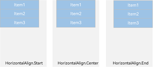
Alignment of Child Elements Along Cross Axis
In the layout container, use the alignItems attribute to set the alignment mode of child elements along the cross axis. The alignment performance is consistent across screens of various sizes. The value is of the VerticalAlign enum type when the cross axis is in the vertical direction and the HorizontalAlign type when the cross axis is in the horizontal direction.
The layout container also provides the alignSelf attribute to control the alignment mode of a single child element along the cross axis. This attribute has a higher priority than the alignItems attribute. This means that, if alignSelf is set, it will overwrite the alignItems setting on the corresponding child element.
Horizontal Alignment of Child Elements in Column Container
Figure 7 Horizontal alignment of child elements in the Column container
-
HorizontalAlign.Start: Child elements are left aligned horizontally.
Column({}) {
  Column() {
  }.width('80%').height(50).backgroundColor(0xF5DEB3)

  Column() {
  }.width('80%').height(50).backgroundColor(0xD2B48C)

  Column() {
  }.width('80%').height(50).backgroundColor(0xF5DEB3)
}.width('100%').alignItems(HorizontalAlign.Start).backgroundColor('rgb(242,242,242)')
-
HorizontalAlign.Center: Child elements are center-aligned horizontally.
Column({}) {
  Column() {
  }.width('80%').height(50).backgroundColor(0xF5DEB3)

  Column() {
  }.width('80%').height(50).backgroundColor(0xD2B48C)

  Column() {
  }.width('80%').height(50).backgroundColor(0xF5DEB3)
}.width('100%').alignItems(HorizontalAlign.Center).backgroundColor('rgb(242,242,242)')
-
HorizontalAlign.End: Child elements are right-aligned horizontally.
Column({}) {
  Column() {
  }.width('80%').height(50).backgroundColor(0xF5DEB3)

  Column() {
  }.width('80%').height(50).backgroundColor(0xD2B48C)

  Column() {
  }.width('80%').height(50).backgroundColor(0xF5DEB3)
}.width('100%').alignItems(HorizontalAlign.End).backgroundColor('rgb(242,242,242)')
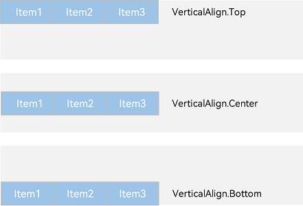
Vertical Alignment of Child Elements in Row Container
Figure 8 Vertical alignment of child elements in Row container
-
VerticalAlign.Top: Child elements are top-aligned vertically.
Row({}) {
  Column() {
  }.width('20%').height(30).backgroundColor(0xF5DEB3)

  Column() {
  }.width('20%').height(30).backgroundColor(0xD2B48C)

  Column() {
  }.width('20%').height(30).backgroundColor(0xF5DEB3)
}.width('100%').height(200).alignItems(VerticalAlign.Top).backgroundColor('rgb(242,242,242)')
-
VerticalAlign.Center: Child elements are center-aligned vertically.
Row({}) {
  Column() {
  }.width('20%').height(30).backgroundColor(0xF5DEB3)

  Column() {
  }.width('20%').height(30).backgroundColor(0xD2B48C)

  Column() {
  }.width('20%').height(30).backgroundColor(0xF5DEB3)
}.width('100%').height(200).alignItems(VerticalAlign.Center).backgroundColor('rgb(242,242,242)')
-
VerticalAlign.Bottom: Child elements are bottom-aligned vertically.
Row({}) {
  Column() {
  }.width('20%').height(30).backgroundColor(0xF5DEB3)

  Column() {
  }.width('20%').height(30).backgroundColor(0xD2B48C)

  Column() {
  }.width('20%').height(30).backgroundColor(0xF5DEB3)
}.width('100%').height(200).alignItems(VerticalAlign.Bottom).backgroundColor('rgb(242,242,242)')
Adaptive Stretching
In linear layout, adaptive stretching is achieved by using the
@Entry
@Component
struct BlankExample {
  build() {
    Column() {
      Row() {
        Text('Bluetooth').fontSize(18)
        Blank()
        Toggle({ type: ToggleType.Switch, isOn: true })
      }.backgroundColor(0xFFFFFF).borderRadius(15).padding({ left: 12 }).width('100%')
    }.backgroundColor(0xEFEFEF).padding(20).width('100%')
  }
}
Figure 9 Portrait mode
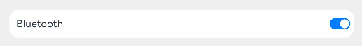
Figure 10 Landscape mode

Adaptive Scaling
Adaptive scaling means that the size of a child element is automatically adjusted according to a preset ratio to fit into the container across devices of various screen sizes. In linear layout, adaptive scaling can be achieved using either of the following methods:
-
When the container size is determined, use layoutWeight to set the weight of a child element during layout. The container space is then allocated along the main axis among the element and sibling elements based on the set layout weight, ignoring the size settings of the elements themselves.
@Entry
@Component
struct layoutWeightExample {
  build() {
    Column() {
      Text('1:2:3').width('100%')
      Row() {
        Column() {
          Text('layoutWeight(1)')
            .textAlign(TextAlign.Center)
        }.layoutWeight(1).backgroundColor(0xF5DEB3).height('100%')

        Column() {
          Text('layoutWeight(2)')
            .textAlign(TextAlign.Center)
        }.layoutWeight(2).backgroundColor(0xD2B48C).height('100%')

        Column() {
          Text('layoutWeight(3)')
            .textAlign(TextAlign.Center)
        }.layoutWeight(3).backgroundColor(0xF5DEB3).height('100%')

      }.backgroundColor(0xffd306).height('30%')

      Text('2:5:3').width('100%')
      Row() {
        Column() {
          Text('layoutWeight(2)')
            .textAlign(TextAlign.Center)
        }.layoutWeight(2).backgroundColor(0xF5DEB3).height('100%')

        Column() {
          Text('layoutWeight(5)')
            .textAlign(TextAlign.Center)
        }.layoutWeight(5).backgroundColor(0xD2B48C).height('100%')

        Column() {
          Text('layoutWeight(3)')
            .textAlign(TextAlign.Center)
        }.layoutWeight(3).backgroundColor(0xF5DEB3).height('100%')
      }.backgroundColor(0xffd306).height('30%')
    }
  }
}
Figure 11 Landscape mode
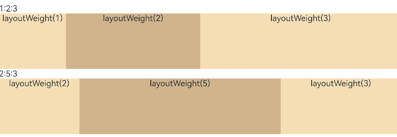
Figure 12 Portrait mode

-
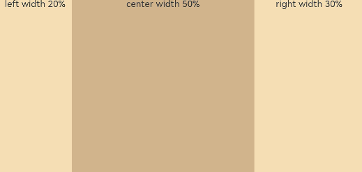
When the container size is determined, set the width of a child element in percentage. The container space is then allocated among the element and sibling elements based on the set percentage.
@Entry
@Component
struct WidthExample {
  build() {
    Column() {
      Row() {
        Column() {
          Text('left width 20%')
            .textAlign(TextAlign.Center)
        }.width('20%').backgroundColor(0xF5DEB3).height('100%')

        Column() {
          Text('center width 50%')
            .textAlign(TextAlign.Center)
        }.width('50%').backgroundColor(0xD2B48C).height('100%')

        Column() {
          Text('right width 30%')
            .textAlign(TextAlign.Center)
        }.width('30%').backgroundColor(0xF5DEB3).height('100%')
      }.backgroundColor(0xffd306).height('30%')
    }
  }
}
Figure 13 Landscape mode
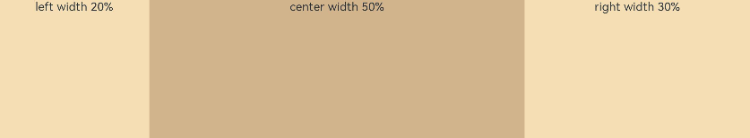
Figure 14 Portrait mode
Reference
For additional information please refer to Linear Layout