List and Grid Components
List Component
Lists are common components in mobile applications. Examples include settings pages, contact lists, and product catalogs.
The List component supports the generation of child components in various rendering modes like conditional rendering and rendering of repeated content.
List Layout
A list automatically arranges child components in the direction it scrolls. Adding or removing child components from the list will trigger re-arrangement of the child components.
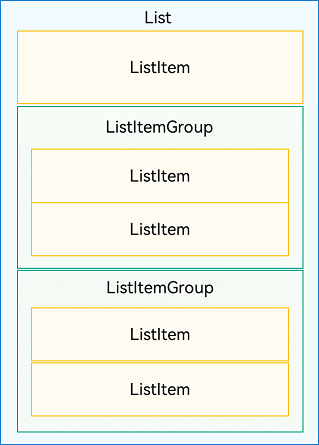
As shown in the following figure, in a vertical list, ListItemGroup or ListItem components are automatically arranged vertically.
ListItemGroup is used to display list data by group. Its child component is also ListItem. ListItem represents a list item, which can contain a single child component.
Figure 1 Relationships between List, ListItemGroup, and ListItem
Note
A List component can contain only ListItemGroup or ListItem as its child components. ListItemGroup and ListItem must be used together with List.
Displaying Data in a List
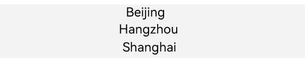
The list displays a collection of items horizontally or vertically and can scroll to reveal content off the screen. In the simplest case, a List component is statically made up of ListItem components.
Figure 2 Example of a city list
@Entry
@Component
struct CityList {
  build() {
    List() {
      ListItem() {
        Text('Beijing').fontSize(24)
      }

      ListItem() {
        Text('Hangzhou').fontSize(24)
      }

      ListItem() {
        Text('Shanghai').fontSize(24)
      }
    }
    .backgroundColor('#FFF1F3F5')
    .alignListItem(ListItemAlign.Center)
  }
}
Each ListItem component can contain only one root child component. Therefore, it does not allow for child components in tile mode. If tile mode is required, encapsulate the child components into a container or create a custom component.
Figure 3 Example of a contacts list

As shown above, each contact appears as a list item with a profile picture and name. Place the Image and Text components in a Row container.
List() {
  ListItem() {
    Row() {
      Image($r('app.media.iconE'))
        .width(40)
        .height(40)
        .margin(10)

      Text ('Tom')
        .fontSize(20)
    }
  }

  ListItem() {
    Row() {
      Image($r('app.media.iconF'))
        .width(40)
        .height(40)
        .margin(10)

      Text ('Tracy')
        .fontSize(20)
    }
  }
}
Iterating List Content
Compared with a static list, a dynamic list is more common in applications. You can use ForEach to obtain data from the data source and create components for each data item.
For example, when creating a contact list, store each contact's name and profile-picture data in a Contact object in the contacts array. Nest ListItem components in ForEach to reduce repeated code.
import util from '@ohos.util';

class Contact {
  key: string = util.generateRandomUUID(true);
  name: string;
  icon: Resource;

  constructor(name: string, icon: Resource) {
    this.name = name;
    this.icon = icon;
  }
}

@Entry
@Component
struct SimpleContacts {
  private contacts: Array<object> = [
    new Contact ('Tom', $r("app.media.icon_user1")),
    new Contact ('Tracy', $r("app.media.icon_user2")),
  ]

  build() {
    List() {
      ForEach(this.contacts, (item: Contact) => {
        ListItem() {
          Row() {
            Image(item.icon)
              .width(40)
              .height(40)
              .margin(10)
            Text(item.name).fontSize(20)
          }
          .width('100%')
          .justifyContent(FlexAlign.Start)
        }
      }, (item: Contact) => JSON.stringify(item))
    }
    .width('100%')
  }
}
Download the icons used in the example, icon_user1 and icon_user2, and place them in the following project directory:
Your project -> entry -> src -> main -> resources -> base -> media.


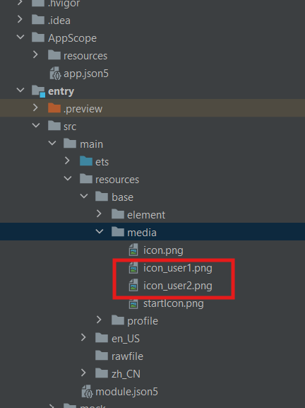
The result is shown below:

Customizing the List Style
Setting the Spacing
When initializing a list, you can use the space parameter to add spacing between list items. In the following example, a 10vp spacing is added between list items along the main axis:
Adding Dividers
A divider separates UI items to make them easier to identify.
To add dividers between list items, use the divider attribute with the following style attributes:
strokeWidth and color: the width and color of the divider, respectively.
startMargin and endMargin: distance between the divider and the start edge and end edge of the list, respectively.
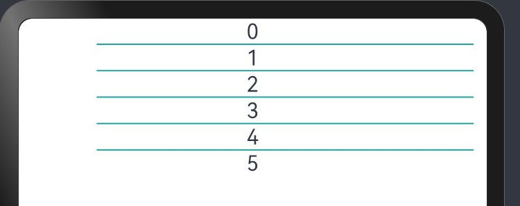
The following example draws a divider with a stroke thickness of 1 vp from a position 60 vp away from the start edge of the list to a position 10 vp away from the end edge of the list.
class DividerTmp {
  strokeWidth: Length = 1
  startMargin: Length = 60
  endMargin: Length = 10
  color: ResourceColor = '#ffe9f0f0'

  constructor(strokeWidth: Length, startMargin: Length, endMargin: Length, color: ResourceColor) {
    this.strokeWidth = strokeWidth
    this.startMargin = startMargin
    this.endMargin = endMargin
    this.color = color
  }
}

@Entry
@Component
struct EgDivider {
  @State egDivider: DividerTmp = new DividerTmp(1, 60, 10, '#ff0da2a2')
  private numList: number[] = [0, 1, 2, 3, 4, 5]

  build() {
    List() {
      ForEach(this.numList, (item: number) => {
        ListItem() {
          Row() {
            Text(`${item}`)
          }
          .width('100%')
          .justifyContent(FlexAlign.Center)
        }
      })
    }
    .divider(this.egDivider)
  }
}
Figure 4 Using dividers between the list items
Note
-
The stroke width of the divider causes some space between list items. If the content spacing set for the list is smaller than the stroke width of the divider, the latter is used instead.
-
When a list contains multiple columns, the startMargin and endMargin attributes of the divider apply to each column.
-
The divider is drawn between list items. No divider is drawn above the first list item and below the last list item.
Adding a Scrollbar
When the total height (width) of list items exceeds the screen height (width), the list can scroll vertically (horizontally). The scrollbar of a list enables users to quickly navigate the list content, as shown below.
Figure 5 Scrollbar of a list

When using the List component, you can use the scrollBar attribute to control the display of the list scrollbar. The value type of scrollBar is BarState. When the value is BarState.Auto, the scrollbar is displayed as required: It is displayed when the scrollbar area is touched and becomes thicker when being dragged; it automatically disappears after 2 seconds of inactivity.
The default value of the scrollBar attribute is BarState.Off in API version 9 and earlier versions and BarState.Auto since API version 10.
Grid Component
The grid layout consists of cells formed by rows and columns. You can specify the cells where items are located to create various layouts. The grid layout excels at dividing a page into regions and defining the proportion of child components. It is a key adaptive layout and applies to scenarios such as photo gallery, calendar, and calculator.
Grid Layout
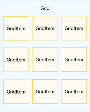
Each item in the Grid container corresponds to a GridItem component, as shown below.
Figure 1 Relationship between Grid and GridItem components
Note
The Grid component accepts only GridItem as its child.
Displaying Data in a Grid
The grid layout organizes its elements in two dimensions, as shown in the following figure.
Figure 2 General office services
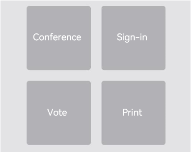
The Grid component can display a group of GridItem child components in two-dimensional layout mode.
Grid() {
  GridItem() {
    Text('Conference')
      ...
  }

  GridItem() {
    Text('Sign-in')
      ...
  }

  GridItem() {
    Text ('Vote')
      ...
  }

  GridItem() {
    Text ('Print')
      ...
  }
}
.rowsTemplate('1fr 1fr')
.columnsTemplate('1fr 1fr')
Iterating Grid Content
For multiple GridItem components with similar content structures, you are advised to nest them in ForEach statements to reduce repeated code. The effect is the same as above figure 2.
@Entry
@Component
struct OfficeService {
  @State services: Array<string> = ['Conference', 'Vote','Sign-in', 'Print']

  build() {
    Column() {
      Grid() {
        ForEach(this.services, (service:string) => {
          GridItem() {
            Text(service)
          }
        }, (service:string):string => service)
      }
      .rowsTemplate(('1fr 1fr') as string)
      .columnsTemplate(('1fr 1fr') as string)
    }
  }
}
Setting the Number and Proportion of Rows and Columns
You can set the number and proportion of rows and columns to determine the overall arrangement mode of the grid layout. To do so, use the rowsTemplate and columnsTemplate attributes of the Grid component.
The values of rowsTemplate and columnsTemplate are a string consisting of 'number+fr' segments, separated by spaces. Wherein fr indicates the number of rows or columns in the grid layout, and the number in front of fr is used to calculate the proportion of the row or column in the grid width, thereby determining the width of the row or column.
Figure 3 Example of the proportion of rows and columns
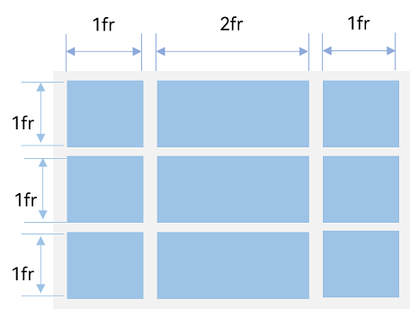
The preceding figure shows a grid layout with three rows and three columns. The grid layout is divided into three parts in the vertical direction with each row taking up 1/3, and four parts in the horizontal direction with the first column taking up 1/4, the second column 2/4, and the third column 1/4.
This layout can be implemented by setting rowsTemplate to '1fr 1fr 1fr' and columnsTemplate to '1fr 2fr 1fr'.
Note
When rowsTemplate or columnsTemplate is set for the Grid component, its layoutDirection, maxCount, minCount, and cellLength attributes do not take effect.
Additional Information
For more information, see Creating a List and Creating a Grid.